

You want your step and repeat banner to look sharp and professional, but blurry logos and bad designs can ruin the whole effect. Most times, the real issue isn’t the printing—it’s the artwork you submit. If you’ve ever felt disappointed by a pixelated banner, you’re not alone. You can solve the problem by learning a few basics about print-ready files and design. With the right tips, you’ll get a banner that makes your brand stand out.
Artwork Quality Issues

Low-Resolution Logos
Your logo may look great on your computer. When you use a JPG from your website, it seems clear and bright. But printing that image on a big step and repeat banner causes problems. The logo can turn blurry and lose its sharp edges. This happens because the file does not have enough resolution. The amount of pixels in your artwork decides how clear it will be when printed. If your logo has low resolution, you will see fuzzy lines and faded colors on your banner.
Low resolution logos can make prints look blurry and pixelated.
High-resolution images are important for clear and sharp prints.
Low-resolution images have fewer pixels, so they lose detail and look blurry when printed.
You want your brand to be noticed, not ignored. Always check your artwork’s resolution before printing. If you use a high-resolution file, your banner will look neat and bold.
Tip: Do not use small JPGs from your website for big banners. Ask your designer for the original high-resolution artwork file.
Vector vs. Raster Files
When you get your artwork ready, you should know about raster and vector files. Raster images, like JPGs and PNGs, are made of tiny squares called pixels. These files depend on their resolution. If you make a raster image bigger, it gets blurry and loses quality. Vector graphics, such as AI or EPS files, use math to make shapes and lines. You can make vector artwork any size, and it always looks sharp.
Raster images have a set number of pixels, so they depend on resolution.
Vector graphics use math, so you can make them bigger without losing quality.
Making a raster image larger makes it blurry, but vector images stay clear no matter the size.
Vector files work well for step and repeat banners. You can change your logo size for any banner, and it will always look clean. Vector artwork also lets you change your design easily. If you want your banner to look sharp and professional, use vector files for your artwork

DPI and Print Size
DPI means “dots per inch.” It shows how many dots of color fit in one inch of your printed artwork. More DPI makes your banner look clearer and brighter. For step and repeat banners, you should use at least 100 to 200 DPI at full size. If your artwork has low DPI, your images will look faded and blurry. High DPI helps your logo and graphics stand out.
A higher DPI makes images look clearer and brighter.
For big banners, a DPI of at least 300 is best for sharp prints.
Low resolution can make images look faded and blurry, which is not good for banners.
Here is a quick chart for recommended DPI values for different banner types:
Banner Type | Recommended DPI Range |
|---|---|
Roll-Up Banner | 75 dpi to 150 dpi |
Very Large Files | 750 dpi to 1500 dpi (1:10 scale) |
General Print Data | At least 300 dpi |
If you want your step and repeat banner to look great, always check the resolution and DPI of your artwork before printing. This easy step can help your brand look its best at any event.
Solve the Problem with Print-Ready Files
You want your step and repeat banner to look amazing. To solve the problem of poor prints, you need to understand how to prepare print-ready files. This means you must pay attention to file formats, color modes, and image resolution. If you get these details right, you will fix low-resolution artwork and avoid blurry banners.
File Formats and Color Modes
When you submit your artwork, you should use the correct file format. The best choices are AI, EPS, or PDF files. These formats keep your logo sharp and clear. High-res JPG or PNG files can work, but only if they have enough dpi and image resolution. If you use a low-quality file, your banner will not look good.
Color mode matters too. You might see RGB and CMYK when you work with your files. RGB is for screens, but banners need CMYK. If you use RGB, the colors might shift or look dull when printed. CMYK gives you more predictable results and better color accuracy for print-ready files.
Here’s a quick table to show the difference between RGB and CMYK:
Aspect | RGB (Additive) | CMYK (Subtractive) |
|---|---|---|
Color Range | Limited color representation for printing | |
Conversion Issues | Can lead to color shifts when converted | More predictable in print |
Usage | Ideal for digital displays | Standard for printed materials |
Color Accuracy | May not match printed output | Requires specific profiles for accuracy |
Example of Colors | Bright neon colors may not print well | PANTONE colors may not be accurately reproduced |
If you want to solve the problem of color shifts, always set your artwork to CMYK before you send it for printing. This step helps you get the quality you expect.
Pre-Press Validation
You can solve the problem of blurry banners by using a pre-press validation system. This system checks your files before printing. It looks for low image resolution, wrong dpi, and incorrect color modes. If your file has issues, you get a warning right away. You can fix low-resolution artwork before it becomes a problem.
Some companies use automated checks. Others have experts review your files. Both methods help you avoid bad prints. When you catch mistakes early, you save time and money. You also get a banner that shows off your brand with quality.
Tip: Always ask if your printer uses pre-press validation. This step can solve the problem before it starts.
Print-Ready Files Checklist
You want to stay organized and avoid mistakes. A checklist helps you solve the problem of missing details. It keeps track of everything you need for print-ready files. You can check off each item and make sure your artwork meets all requirements for quality.
Here’s a simple checklist to help you prepare your files:
Use the correct file format (AI, EPS, PDF, or high-res JPG/PNG)
Set color mode to CMYK for printing
Make sure your image resolution is at least 100-200 dpi at full size
Check that all logos and graphics are sharp and clear
Leave enough space for trimming and safe zones
Review the layout for proper spacing and sizing
This checklist helps you focus and stay organized. You can solve the problem of poor prints by following each step. You will get a banner with the quality you want.
Note: If you are not sure about dpi or image resolution, ask your designer or printer for help. They can guide you and make sure your files are print-ready.
When you understand file formats, color modes, and image resolution, you solve the problem of blurry and unattractive banners. You get the quality your brand deserves. Use pre-press validation and a checklist to make sure your print-ready files are perfect every time.
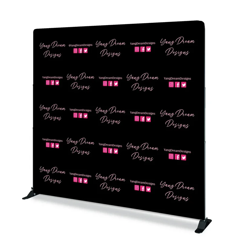
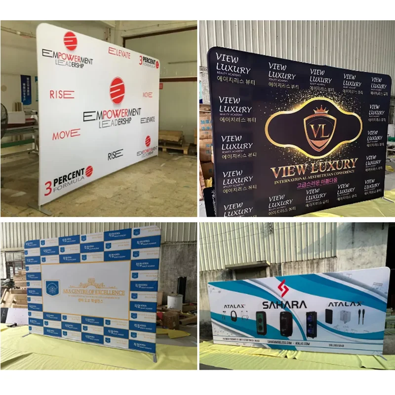
Design Quality for Step and Repeat Banners


Logo Placement and Sizing
You want your logo to stand out in every photo. Many people make the mistake of using a logo that is too small or too large. If your logo is too big, it gets covered by people standing in front of the banner. If it’s too small, it disappears in the background. Place your logo in a repeating pattern and keep it at a size that is easy to see but not overwhelming. Use vector files for your logo to keep it sharp at any size. Always check your logo’s resolution before you send your artwork. High-resolution logos help your brand look professional.
Tip: Ask your designer for a vector version of your logo. This keeps your logo crisp and clear on every banner.
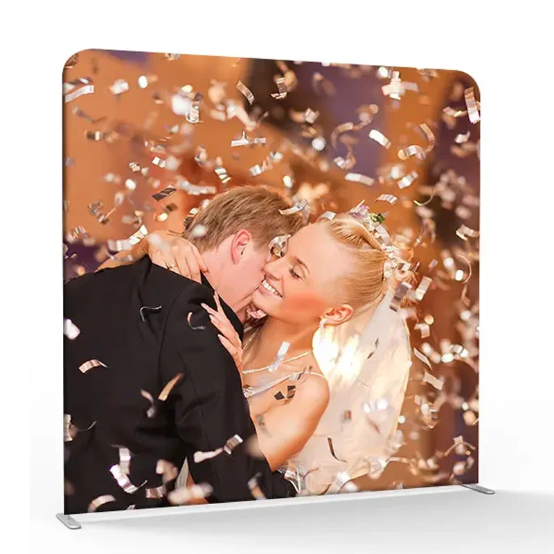
Color Contrast and Backgrounds
Color plays a huge role in how your banner looks. You want your logo to pop against the background. Poor color choices can make your logo hard to see. Avoid using pure black on white, which can cause flickering. Try dark gray instead. Stay away from red on green or blue on red, since these combinations hurt readability. Pick harmonious color schemes like monochromatic or analogous colors for a pleasant look. Good color contrast helps your logo stand out and improves color accuracy in print. Always set your files to CMYK mode for better color accuracy.
Avoid red on green or blue on red.
Choose harmonious color schemes for better color accuracy.
Set artwork to CMYK for print color accuracy.
Spacing and Layout
A balanced design makes your banner look clean and professional. Too much spacing between logos can break the connection, while too little makes the design look crowded. Consistent spacing keeps your layout neat. Increase letter spacing in headlines (+20 to +60 tracking) for better readability. For body text, a slight increase (+10 to +30) helps, especially with sans-serif fonts. Use white space to highlight your logo and message. Here’s a table with layout principles to guide your design:
Principle | Description |
|---|---|
Color Choice | Use colors that fit your brand and stand out, but don’t overwhelm. |
Visual Hierarchy | Place your logo and headings where people look first. |
Images and Graphics | Use high-resolution images that support your message. |
Balanced Layout | Keep your design balanced and avoid clutter. |
Use of White Space | Add white space to make your logo and message clear. |
Good spacing and layout help your logo shine and make your banner easy to read.
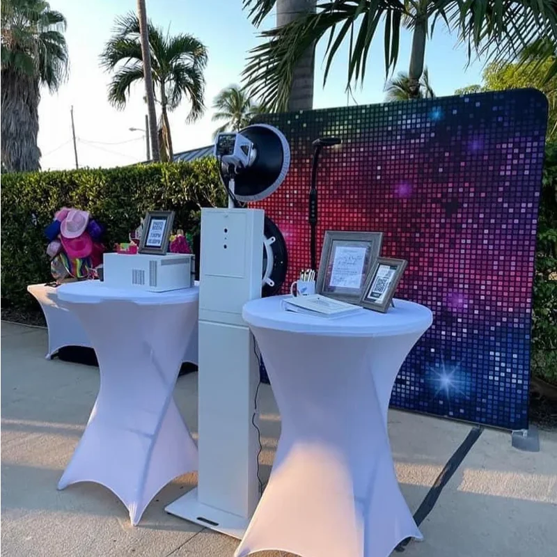
Professional Help and Education
Tiered Design Services
You want your step and repeat backdrop to look great. Manufacturers can help with different design services. Sometimes you need a quick fix for low resolution artwork. This might be a free adjustment or a simple file check. Other times, you need paid design help for logo vectorization or custom layouts. These services use special tools to make logos look sharp. They also help banners, canvas prints, and pop-up displays get done faster. Here’s a table that shows how professional design services help:
Benefit Description | Details |
|---|---|
Use of Special Tools | Makes step and repeat backdrops and canvas prints faster to produce. |
Efficient Design Creation | Helps set up textile and pattern graphics quickly. |
Faster Completion Times | Speeds up making banners and artwork. |
Paid services give you more choices. You get better templates and more ways to customize your design. These features help your brand stand out. Free services are good for simple needs. Professional design makes your step and repeat backdrop look even better.
Templates and Tools
You do not have to make your design from nothing. Online tools and templates help you create a step and repeat backdrop easily. Paid tools like Canva Pro have lots of graphics and templates. Free tools have fewer options. If you want your event to look special, use these tools for extra detail. Templates show you where to put logos and how to space them. They help you avoid mistakes with ppi, dpi, and color settings. This saves time and helps you get good printing results.
Customer Education
You can stop problems with low resolution artwork if you know what to check. Manufacturers teach you about print-ready files and design quality. They explain file formats, color space, bleed, and resolution. Here’s a table with important things to remember:
Requirement Type | Details |
|---|---|
Recommended File Formats | PDF, JPG, TIF, AI, EPS; change Office files to PDF. |
Color Space & Profile | Use CMYK or Grayscale for printing. |
Bleed & Safety Margins | At least 2 mm bleed; keep important details 2 mm from the edge. |
Resolution | 300 dpi for clear prints; do not use low resolution artwork. |
Downloads & Templates | Use templates to avoid mistakes and make production smooth. |
Manufacturers also help by teaching and mentoring. You can join training and study groups to learn new skills. You get advice on making a step and repeat backdrop that looks strong. This support helps you avoid mistakes and makes your logos look professional.
Tip: Always ask for templates and guides before you start your design. You will save time and get better results.
You can make your step and repeat banner look great by following easy steps. Always pick a high resolution image and a good graphic for your banners and backdrop. Check your image quality and make sure the resolution is high. Use the right file format for your artwork. Look over your files before you send them to print. Here is a simple checklist to help you get the best banner and backdrop:
Use print-ready files for banners and backdrop.
Make sure banners and backdrop have 300 DPI and CMYK color mode.
Check bleed and safety margins for banners and backdrop.
Ask for a proof before printing banners and backdrop.
Specification | Details |
|---|---|
Final Format | |
Data Format | 87.0 x 240.0 cm (with bleed) |
Visible Area | 85.0 x 215.0 cm |
Safety Margin | 4 mm from edge |
Design Software | InDesign |
Template | Free template available |
Getting a proof lets you check if your banners and backdrop look right. If you need help, ask an expert for advice. You should have a step and repeat banner that helps your brand stand out at every event.