

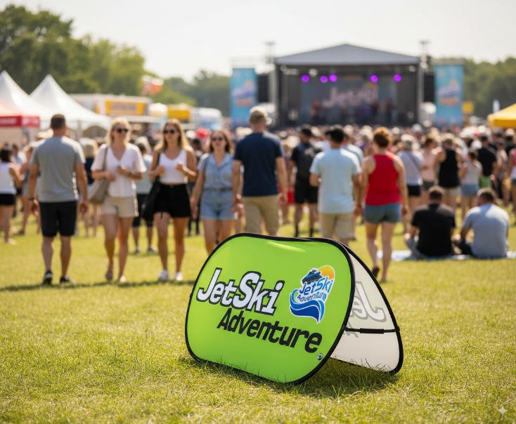
Want to get noticed and connect with real customers? Custom A Frame sideline signs help you reach people walking by. You can turn busy places into great spots for marketing. If your A Frame sideline sign shows your brand’s message, your brand gets stronger. You also make messages that stand out and have a big effect.
Studies show that knowing a brand makes people feel more. It also helps them pay more attention. If you know your brand’s goal and who you want to reach, your A Frame sideline signs work even better.
With smart changes, you will see how sidewalk signs help small businesses. Clear A Frame sideline signs and strong branding help you get better results.
Define Purpose and Audience for A-Frame Signage

Clarify Brand Message
Before you design your A Frame sideline sign, you need to know what you want to say. Think about your brand’s main idea. What do you want people to remember when they see your sign? The book “Building a Storybrand” explains that simple messages help people connect with your brand. If you keep your message clear, people will understand what you offer right away. Donald Miller, the author, also shares that short and repeatable soundbites work best. When you use easy words, you make it simple for customers to know why they should care about your business.
Try this: Write down your main idea in one sentence. Ask yourself, “Would someone who walks by understand this in five seconds?” If the answer is yes, you are on the right track.
Tip: Use words that show the benefit your brand brings. People want to know how you can help them.
Identify Target Audience
Now, think about who you want to reach. Are you talking to parents at a sports event, students on a campus, or shoppers at a market? When you know your audience, you can choose words, colors, and images that speak to them. For example, bright colors and playful fonts might catch the eye of families, while bold and simple designs may work better for professionals.
Make a quick list of your ideal customers. What do they like? What problems do they have? When you match your sign to your audience, you make a bigger impact.
Remember, knowing your purpose and audience helps you make smart choices for your A Frame sideline sign. Every design step gets easier when you start with these basics.
Design Effective A-Frame Signage

You want your custom a-frame signs to grab attention and deliver your message fast. Let’s break down some effective design tips that help you create effective a-frame signage with real impact.
Use Bold, Readable Fonts
When you design a-frame signs, choose fonts that stand out. Bold, easy-to-read fonts make your message clear, even from a distance. Strong white letters on a dark background work well in sunlight and shade. If your sign sits outside, you need people to read it quickly. Using bold fonts helps your custom a-frame signs get noticed in busy places. You want your message to pop, not blend in.
Limit Fonts for Clarity
Too many fonts can make your signage look messy. Stick to one or two font families for your a-frame signs. Use one font for the headline and another for the details. If you add a third font, keep it simple. This keeps your layout clean and professional. People will find your message easier to read and remember.
One font for body text
Avoid more than two fonts
Choose High-Contrast Colors
Color choices matter for effective a-frame signage. High-contrast colors make your custom a-frame signs easy to see. Here’s a quick table showing color combinations that work best:
Color Combination | Description |
|---|---|
Black and White | Highest contrast, ideal for text-heavy signs. |
Yellow and Black | Attention-grabbing, standard for warning signs. |
Blue and White | Strong contrast, professional appearance. |
Red on White | Effective for stop signs and prohibition symbols. |
Warm Colors | Grab attention, effective against cool backgrounds. |
Pick colors that help your message stand out. If you use black and white, people can read your sign from far away. Yellow and black catch the eye and work well for important messages. Your color choices boost visual appeal and make your signage more effective.
Align Colors with Brand Identity
Colors do more than look good. They help people remember your brand. When you use the same colors on your custom a-frame signs as you do in your other branding, you strengthen branding and make your business easier to spot. Research shows that color consistency can increase brand recognition by up to 80%. Keep your color palette the same across all signage and marketing materials. This creates a strong visual signature and helps customers remember you.
Tip: Use your brand’s main colors for backgrounds, headlines, or borders. This helps your custom a-frame signs match your other branding and boosts impact.
Keep Messaging Clear and Concise
People walk by quickly. You need your message to be short and easy to read. Focus on one main idea for your a-frame signs. Avoid clutter and extra words. Use high-contrast colors so your message stands out. Add visuals or graphics if they help explain your point. Update your signage often to keep things fresh and interesting.
Use high-contrast colors
Reflect your brand identity
Add visuals for extra impact
Add a Strong Call-to-Action
Every effective a-frame sign needs a clear call-to-action. A good CTA tells people what to do next. Do you want them to visit your store, scan a QR code, or ask for a free sample? Make your CTA bold and easy to spot. Place it at the bottom or center of your custom a-frame signs so people see it right away. Use action words like “Shop Now,” “Learn More,” or “Try Free.” A strong CTA increases engagement and helps you reach your goals.
Note: Your CTA should match your brand’s tone and fit the overall layout of your signage. This keeps everything looking professional and helps your message stick.
When you follow these effective design tips, your custom a-frame signs will have more impact. You’ll create effective a-frame signs that match your brand, grab attention, and drive action. Remember, the right layout, colors, and fonts make your signage work harder for you.
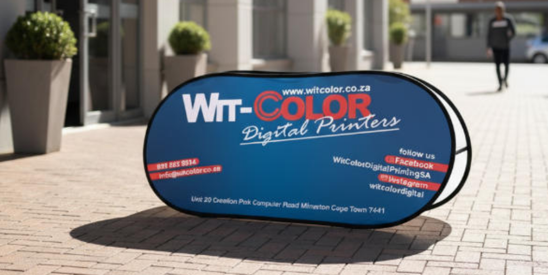
Incorporate Brand Elements in Custom A-Frame Signs

Feature Logo Prominently
Your logo is the face of your business. When you design custom a-frame signs, make sure your logo stands out. Place it at the top or in the center of your signage. People should see your logo first. This helps them remember your business. If you use your logo on all your a-frame signs, you build trust. Customers start to connect your logo with your message and your services. A strong logo placement can boost the impact of your a-frame signage.
Maintain Consistent Brand Colors
Colors do more than make your signage look good. They help you create brand consistency. When you use the same colors on all your custom a-frame signs, you show that your business is professional. People notice when your colors match across different signs. This makes your business look reliable and helps you stand out from competitors. Here’s what happens when you keep your brand colors consistent:
You reinforce your brand identity.
You make your business more memorable.
You encourage customers to choose you over others.
Repeated exposure to the same colors on your a-frame signs increases recognition. Customers will spot your signage from far away and know it’s you. That’s the kind of impact you want for your business.
Use Recognizable Imagery
Images can tell your story fast. Choose pictures or graphics that match your brand and message. If you run a bakery, use photos of your best treats. If you own a gym, show people working out. Make sure the images are clear and easy to see from a distance. When you use the same style of imagery on all your custom a-frame signs, you create a strong look. This helps your branding feel complete and makes your signage more effective. Good imagery grabs attention and adds extra impact to your a-frame signs.
Choose the Right A-Frame Sign Type and Materials
Choosing the right custom a-frame signs can make a big difference for your brand. You want your signage to last, look great, and fit your needs. Let’s break down your options so you can pick the best one for your next event or location.
Compare A-Frame Sign Options
You have many types of a-frame signs to choose from. Each one has its own features. Here’s a quick table to help you compare:
Type of A-Frame Sign | Features |
|---|---|
Standard Signicade | Classic plastic, easy to carry, holds 24″ x 36″ posters, user-friendly. |
Metal A Frames | Durable, top-loading, stands up to weather, great for rigid signs. |
Erasable Write-on/Write-Off Message Boards | Lets you update info daily, perfect for menus or changing messages. |
Rolling Quick-Change Plastic A-Frame | Has wheels for easy moving, space for branding, premium version of standard signicade. |
Wind Sign Plastic A-Frame | Heavy base, fill with water or sand, stays put in strong winds. |
Stainless Steel A-Frame Signs | Weather-resistant, modern look, good for long-term use. |
Mirrored Stainless Steel A-Frames | Reflective, high-impact, great for upscale spots. |
Colored and Matte Finishes | Style options, match your brand colors and interior. |
Acrylic A-Frame | Lightweight, modern, best for indoor use and displays. |
Select Durable, Weather-Resistant Materials
If you plan to use your custom a-frame signs outside, pick materials that last. PVC and aluminum both offer high durability and excellent weather resistance. PVC is light and easy to move, while aluminum gives you a strong, long-lasting frame. These materials help your signage stand up to rain, sun, and wind, so your message stays clear.
Consider Size and Placement Space
Think about where you want to put your a-frame signage. Bigger signs get more attention, but you need enough space for them. Measure your spot before you order. If you want your custom a-frame signs to have the most impact, use strategic placement near busy walkways or entrances. This way, more people see your message.
Ensure Portability and Easy Setup
You want custom a-frame signs that are easy to move and set up. Look for lightweight designs with handles. Some a-frame signs fold flat, so you can store them easily. Tool-free setup saves you time. Wheels or bases you can fill with water or sand add stability for outdoor use. These features help you use strategic placement at different events or locations.
Tip: Always test your signage before the big day. Make sure you can move it, set it up fast, and place it where it gets the most impact.
With the right custom a-frame signs, you can boost your brand and make your message stand out. Smart choices in type, material, and strategic placement give your signage the power to attract and engage.
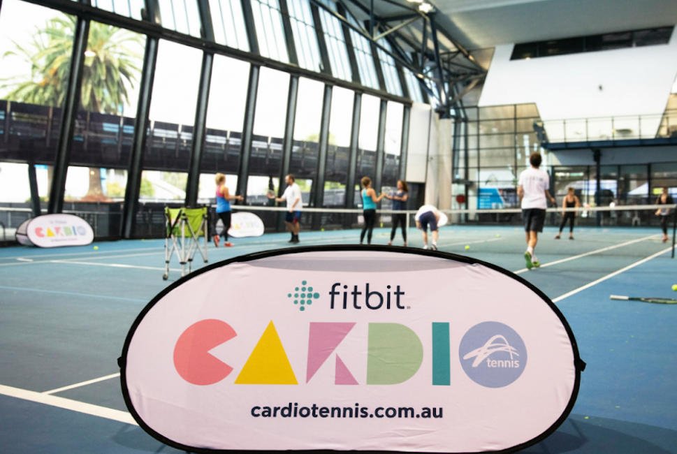
Maximize A Frame Sideline Signs Placement

Position for High Visibility
You want people to see your a frame sideline signs. Put them where lots of people walk. Good places are entrances, food spots, and main walkways. If your sign is in an open space, more people notice it. Businesses get more visitors when signs are in busy areas. The number can go up by over 8%. Drivers can also see your sign if it stands out. Use bright colors and big letters to catch eyes. Here’s a table to help you choose the best places:
Placement Strategy | Why It Works |
|---|---|
Entrances and food spots | Lots of people walk by and stop to look |
Main paths | Many people see your sign all the time |
Open areas, not cluttered corners | No mess around, message is easy to see |
Ticket booths | People need info, easy to show prices and deals |
Avoid Common Placement Mistakes
Sometimes signs are hard to see. Don’t put your a-frame sideline signs behind things. If people can’t see your sign, they miss your message. Don’t block your sign with tables or chairs. Make sure nothing covers your words or pictures. Keep your sign away from busy backgrounds. Change your message often so people keep looking. Here are some tips to help you avoid mistakes:
Put signs where everyone can see them.
Keep signs away from messy or crowded spots.
Change your message to keep people interested.
Use bright colors and fun designs for contests or deals.
Tip: Walk around your event or store. Check if your a-frame is easy to see from different spots.
Adapt Placement for Different Events
Every event needs a new plan for your a-frame sideline signs. At sports games, put signs near entrances and snack stands. At trade shows, place signs at booth corners and main aisles. If your sign is easy to move, you can find better spots fast. Double-sided signs let people see your message from both ways. You can change the graphics for each event. Here’s a table that shows helpful features:
Feature | Description |
|---|---|
Portability | Move signs fast to new places |
Durability | Use signs inside or outside, even in bad weather |
Double-sided display | Show messages to people from both directions |
Customization | Change graphics for new deals or news |
Personalized signs make your brand stand out. Signs you can move and change get people excited. Custom displays help you make a strong impression at busy events. You can get more people to notice and remember your brand by changing where you put your signs.
Maintain and Update A-Frame Signs
Clean and Store Properly
You want your signs to look sharp every time you use them. Regular cleaning keeps your signs bright and easy to read. Wipe off dirt and dust with a soft cloth. For tough spots, use a gentle cleaner. Dry your signs before you put them away. If you store your signs in a cool, dry place, you stop mold and fading.
Choosing the right materials also helps your signs last longer. Here’s a quick table showing smart choices and how they help:
Maintenance Practice | Benefit |
|---|---|
Vinyl-wrapped A-frame signs | Protects wall padding, reduces wear and tear, extends lifespan of the padding. |
Fabric banners | Durable, withstands outdoor conditions, maintains visual appeal, and resists fraying. |
Mesh banners | Allows wind to pass through, reducing strain and minimizing risk of tearing. |
Reinforced stitched hems | Distributes tension evenly, cutting down on damage from wind or pulling. |
UV-resistant inks | Prevents fading and fiber breakdown, maintaining vibrant look over time. |
Quick-drying fabrics | Avoids added weight and sagging after rain, enhancing longevity. |
If you use these materials, you spend less time fixing or replacing your signs. You get more value from every a-frame sign you buy.
Tip: Check your signs after each event. Fix small problems right away so they don’t get worse.
Refresh Designs for Campaigns
People notice new things. If you change your sign designs often, you keep your audience interested. Try updating your signs every two weeks or once a month. This keeps your message fresh and exciting. You can also switch up your designs before big holidays or busy seasons.
Make changes for holidays and special events.
New designs help you stand out. You can show off new deals, promote events, or share fun messages. When you refresh your signs, you show that your brand is active and creative.
Note: A fresh look can turn heads and bring more people to your business.
You can make your a frame sideline signs really stand out. Use smart design and strong materials. Put your signs in the best spots. Match your colors, fonts, and logo so everything looks like your brand. This table shows why matching these things is important:
Source | Key Point |
|---|---|
Designing Effective A-Frame Signage | Signs should use your brand’s colors, fonts, and logo. This helps people know it’s your business. |
Boosting Visibility & Branding | Using your brand’s colors and logo makes your signs easy to spot. It helps people remember your brand. |
Store Branding with Signage | Good branding gets customers interested. It keeps your signs looking the same everywhere. |
Make your cta easy to see and read. Put your cta where people look first. Use a cta that tells people what to do next. Try different cta styles to find what works best. These tips help your a frame sideline signs get noticed. Start making your own signs now and watch your brand get bigger!