[lwptoc numeration=”none”]
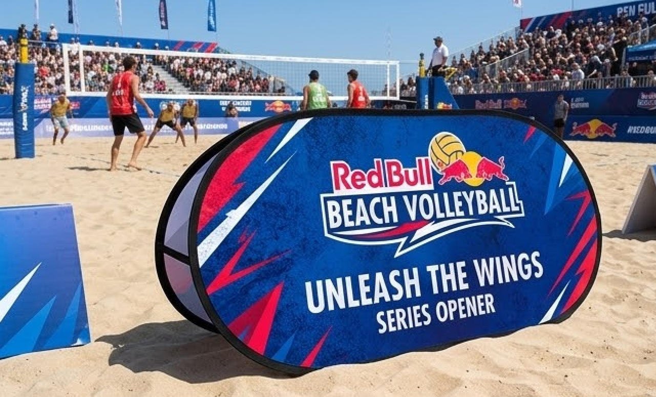
In this competitive business era, businesses must stand out to attract customers. One way to do this is through custom flags and banners that showcase the company’s brand and message. But what makes a custom flag or banner truly effective in capturing the attention of potential customers? The answer lies in the psychology of colors.
Colors have a powerful effect on humans’ emotions and perceptions, and businesses can use this knowledge to their advantage by choosing the right colors for their custom flags and banners. This blog post will explore the psychology of colors and how they can be applied to make your business stand out with custom flags and banners.
The Power of Colors in Marketing
Colors have long been used in marketing to influence consumer behavior. An Institute for Color Research study reveals that people subconsciously judge a product within 90 seconds of seeing it. Up to 90% of that judgment is based on color alone. It shows how important it is for businesses to choose the right colors for their custom flags and banners.
Understanding the Psychology of Colors
Different colors evoke different emotions and perceptions in people. Here is a breakdown of the most commonly used colors in marketing and what they represent
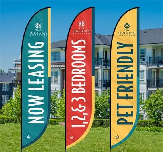
- Red – It’s associated with passion, excitement, and urgency. Red can create a sense of urgency and encourage action, making it a popular choice for sales and promotions.
- Blue – It is often associated with trust, security, and reliability. It can create a sense of calmness and stability, making it a popular choice for financial and technology companies.
- Green – Green is associated with nature, health, and growth. It creates a sense of relaxation and peace, making it a popular choice for eco-friendly and wellness companies.
- Yellow – Yellow is associated with happiness, optimism, and creativity. It can create a sense of warmth and cheerfulness, making it a popular choice for food and entertainment companies.
- Orange – It’s associated with energy, enthusiasm, and excitement. Orange color can create a sense of fun and playfulness, making it a popular choice for sports and recreational companies.
- Purple – It’s associated with luxury, sophistication, and creativity. Purple can create a sense of elegance and glamour, making it a popular choice for high-end fashion and beauty companies.
Choosing the Right Colors for Your Custom Flags and Banners
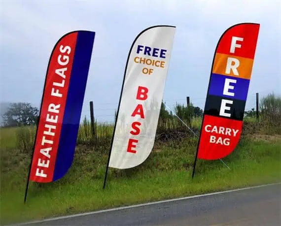
When choosing colors for your custom flags and banners, it’s significant to consider your brand personality, target audience, and the message you want to convey. Here’re a few tips to assist you in choosing the right colors for your custom flags and banners,
Consider the Nature of Your Business
When choosing the colors for your custom flags and banners, it is essential to consider the nature of your business and what it represents. For instance, if you are in the healthcare industry, blue and green are popular choices as they are associated with calmness, trust, and health. And, if you are in the food industry, warm colors such as red, yellow, and orange are ideal as they stimulate appetite and create a sense of excitement.
Know Your Target Audience
Another crucial factor to consider when choosing colors for your custom flags and banners is your target audience. Different colors have different meanings and can evoke different emotions in different people. For instance, younger audiences respond well to bright and bold colors, while older audiences may prefer more muted and subdued tones. It is important to understand your target audience’s demographics, preferences, and cultural background to select the colors that will resonate with them the most.
Choose Complementary Colors
When designing your custom flags and banners, choosing colors that complement each other well is important. Complementary colors are opposite each other on the color wheel, such as blue and orange or yellow and purple. Using complementary colors can create a strong contrast that catches the eye and makes your marketing materials stand out.
Test Different Combinations
It’s always a good idea to test different color combinations to see what works best for your business and target audience. You can create multiple designs with different color schemes and ask colleagues or customers for feedback to see which ones they find most appealing and effective.
By following these expert tips, you can create custom flags and banners that look visually appealing and effectively communicate your brand’s message and resonate with your target audience.

The Placement of Colors in Custom Flags and Banners
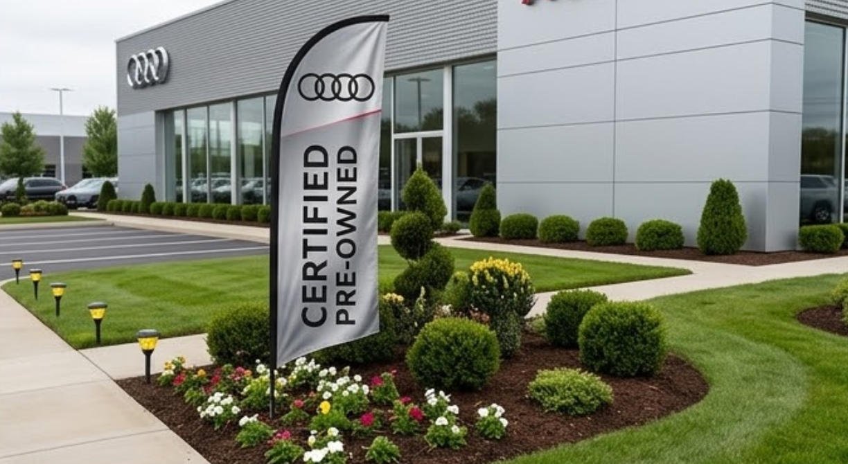
When designing custom flags and banners, the placement of colors can also play a significant role in their effectiveness. For instance, the most crucial message or call-to-action could be emphasized using a different color than the other banner or flag.
Here’re a few fundamental considerations when placing colors on custom flags and banners,
- Message Emphasis –You may use different colors to emphasize the design’s most crucial message or call to action, making it stand out from the rest of the banner or flag.
- Color Harmony – Colors should complement each other to enhance the design rather than detract from it. It can be achieved using a color wheel to identify complementary, analogous, or triadic colors.
- Hierarchy – The placement of colors can also help establish a hierarchy of information, with the most critical message being highlighted using a different color. It can help guide the viewer’s eye and ensure they receive the intended message.
- Balance –The placement of colors should be balanced to ensure that the design does not appear cluttered or overwhelming. Using colors sparingly and strategically is important to create a harmonious and visually appealing design.
By considering the placement of colors on custom flags and banners, businesses can create visually appealing designs that effectively convey their message to potential customers. Working with a professional design team is important to ensure the colors are appropriate for the brand’s image and goals.
How Brands are Utilizing Psychology of Colors in Marketing
Here’re a few real-world examples of companies that have effectively used color psychology in their custom flags and banners
- Coca-Cola – Coca-Cola is one of the most recognizable brands in the world, and its red and white color scheme is a big part of that. Red is a high-energy color that creates a sense of excitement and urgency, which is perfect for a brand that sells a product meant to be consumed for enjoyment. The white color provides a contrast that makes the logo stand out and adds a sense of purity and simplicity to the design.
- Starbucks – Starbucks has successfully used color psychology to create a strong brand identity. The green color in the Starbucks logo is associated with nature, growth, and health, which ties in well with the brand’s focus on high-quality, ethically sourced coffee. The simple, clean design of the logo also creates a sense of sophistication and elegance.
- Whole Foods – Whole Foods is a natural foods grocery store that has become a leader in the organic and natural food industry. The brand’s logo uses green and yellow, which are associated with health and happiness. These colors reflect the brand’s commitment to health and sustainability while creating warmth and friendliness.
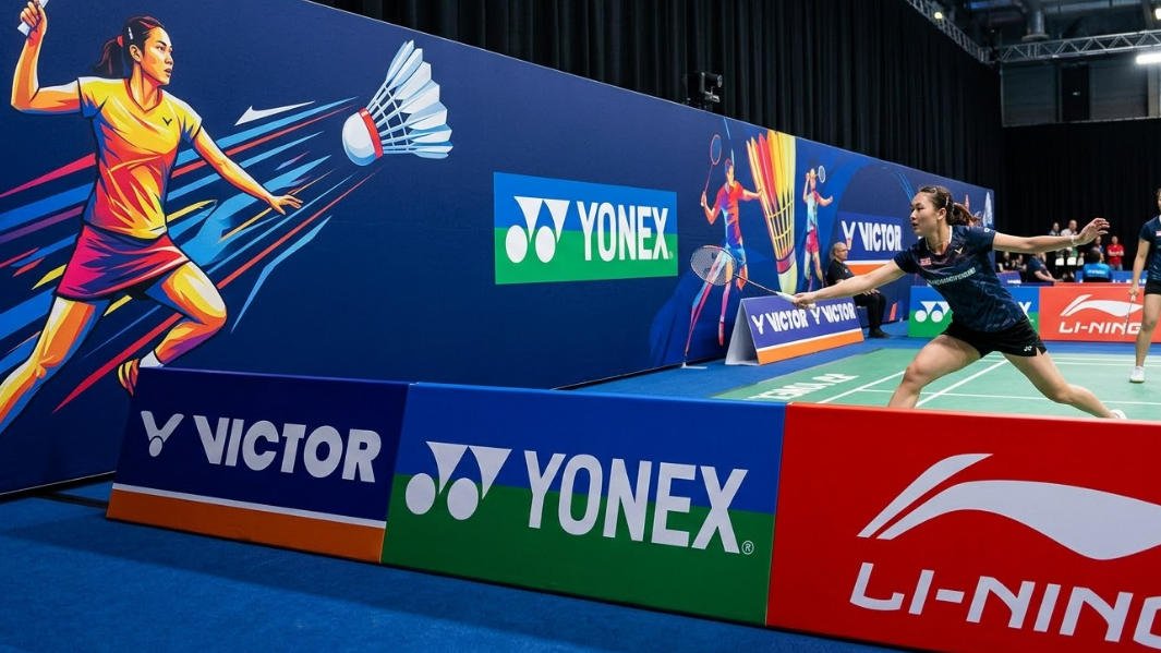
- Nike – Nike is a sports and athletic wear brand with a reputation for being bold, strong, and confident. The company’s iconic “swoosh” logo is a simple design that uses black and white to create a sense of simplicity and sophistication. Black is a powerful color associated with strength and authority, while white represents purity and simplicity. These colors create a bold, memorable logo that perfectly reflects Nike’s brand identity.
- McDonald’s – McDonald’s is a fast-food restaurant chain known for its iconic golden arches logo. Yellow is a bright and cheerful color associated with happiness and optimism, making it a perfect choice for a brand that wants to create a sense of warmth and friendliness. The red color in the logo is associated with passion and excitement, reflecting the fast-paced and lively atmosphere of McDonald’s restaurants.
-
How to Make Your Business Stand Out: The Psychology of Colors in Custom Flags and Banners
Final Words
In summary, the psychology of colors is important for businesses that want to create effective custom flags and banners. By choosing colors that reflect their brand personality and resonate with their target audience, businesses can create a strong emotional connection with potential customers and stand out in a crowded market. Whether a bold red banner for a sales promotion or a calming green flag for an eco-friendly brand, the right colors can make all the difference in creating a memorable and effective marketing campaign. With these tips and real-world examples, businesses can start creating custom flags and banners that truly stand out and capture the attention of their target audience.
It’s essential to partner with a reliable and experienced manufacturer such as Vancke to craft custom flags and banners that truly stand out and capture the attention of potential customers. With a sterling reputation as a leading provider of top-quality custom flags and banners, Vancke offers a vast array of design options and materials to suit the unique needs of any business. Boasting state-of-the-art technology, highly trained personnel, and an unwavering commitment to customer satisfaction, Vancke is the clear choice for businesses seeking to create truly effective and eye-catching custom marketing materials.
