Like you, many other people depend too much on flags for popularity.
It is no doubt that a customized flag is perfect for garnering attention to your business, event, or group.
However, it does not happen with just any feather flag you have.
The best way to achieve this is by making your banner look special enough to grasp their attention. And you can do this by implementing these three essential tips while customizing your banner. They will indeed make your feather flag stand out from the crowd.
Using the right colors and color combinations
You must by now know how much of an influence colors have on your banners. When chosen and used correctly, they can even set the mood everywhere throughout the year.
You may keep these points in mind while designing your business logo and interiors. The same rules apply about colors when it comes to flags:
- The best colors help create the most significant effect on your customers.
- When it comes to colors, they come in three types-primary, secondary and tertiary colors.
- The primary colors are those that don’t come from other colors but can create different colors.
- Secondary colors are the colors produced by mixing primary colors. For example, blue and red make purple, while yellow and blue make green.
- Tertiary colors are a combination of primary and secondary colors. For example, blue and purple make blue-violet.
While it’s not easy mixing different colored paints or printer ink, knowing the relation between colors helps pair them. It is also worth knowing some terms used in the color industry to change a color’s appearance.
- Colors that go well together are complementary in nature. They are usually colors lying opposite each other on the color wheel, like orange and blue.
They create the most substantial contrasts when placed next to each other. When mixed, these colors cancel each other to produce a grayscale color like white. Examples are green and red or orange and blue.
- Analogous colors refer to three adjacent colors that are similar to each other.
- Triadic colors are color schemes comprising of three evenly spaced out colors on the color wheel. Primary colors- red, blue, yellow, and secondary colors orange, green, and purple, are the most basic triadic colors.
- Saturation is the intensity and purity of a color. It is based on light and is also called chroma. While reducing a color’s saturation lightens it, increasing saturation ends up darkening it.
- Tinting involves adding white to colors to make them look lighter.
- Shading is the opposite and involves adding black to colors to make them look darker.
How the right colors can capture a customer’s gaze
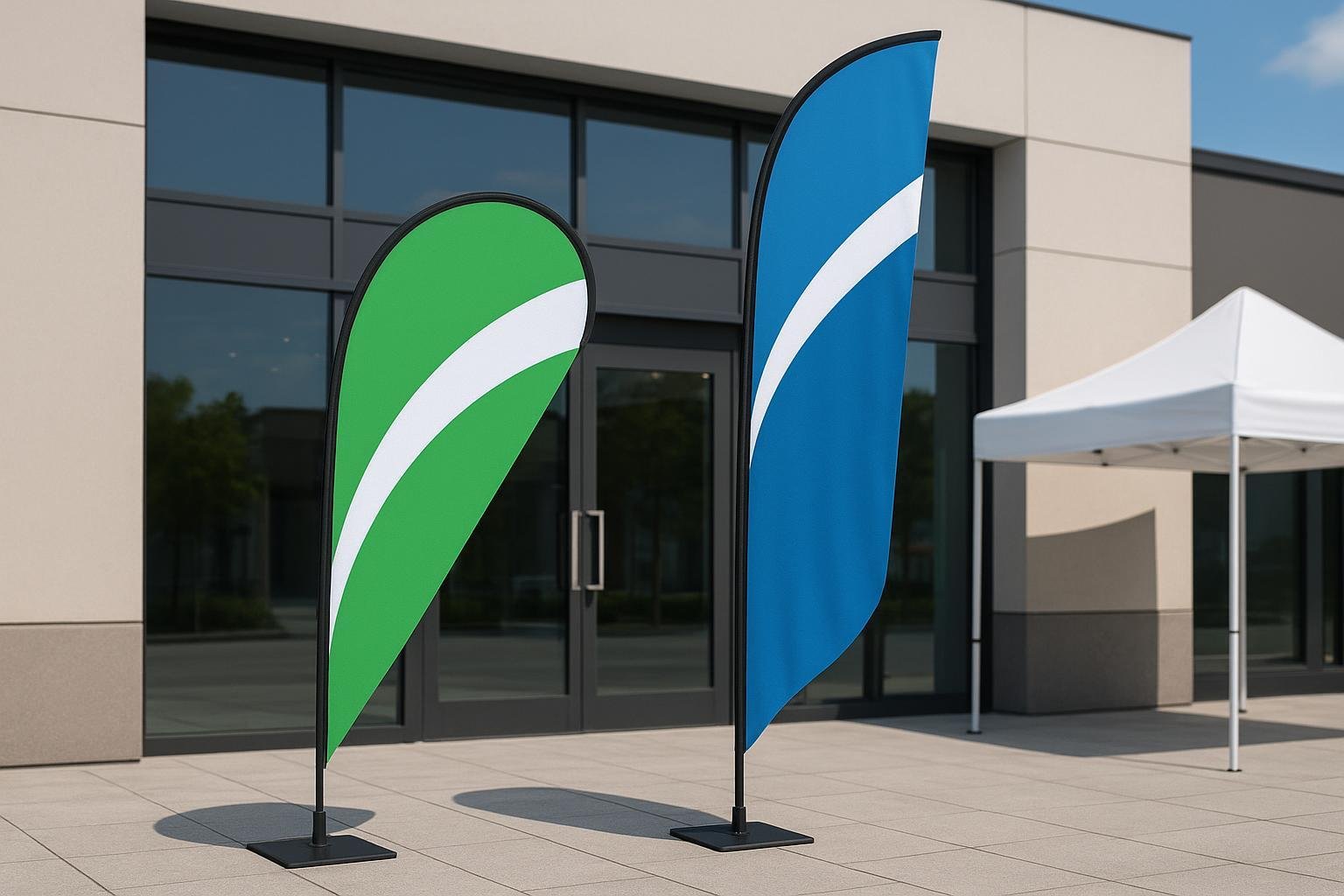
The colors you select for your banner determine how well they grab your customers’ attention. You have to choose based on where you intend to place your banner.
It is because the best colors for outdoor feather flags are the bright hues that stand out. Examples are fiery red, radiant yellow, and neon green. Neutral colors like black, white, and brown, and gray shades are not advisable for outdoor flags.
It is because they tend to easily blend with the environment.
However, it is not that you should not use neutrals on your outdoor banners. You can use them.
However, It would help if you struck a good balance between the bright colors and neutrals to create the best contrast.

Why contrast is so important
You realize the importance of contrast only after learning how different a color can look based on its surrounding colors. For example, red tones tend to stand out on a bluer background, and blue tones stand out more on a redder background.
The neutral used for the background also affects the perception of contrast and size of the different graphics.
For example, a red square in a large black one looks more significant than if placed on a white background.
Similarly, red squares get lost on top of analogous colors like orange while it stands out more against its complementary color, green.
Best contrasting colors for banners
Now you know about colors and the importance of choosing the right colors for your flag. In addition to the right colors, you also have to choose the right color combination.
It should be color combinations that make it easy for people driving by, or who are at a distance, to read the sign. It is proven that a brightness difference of 70% or more offers the best legibility. It usually comprises a dark and light hue.
The best color combinations are:
- Using white or yellow-colored text on a black background
- Yellow or white letters on red or dark blue background
- Black or red letters on a light blue background
- Black, dark blue, green, or red letters on a white or yellow background
These tips and guidelines will help you come up with an aesthetically pleasing customized flag with the right colors.
Selecting the perfect fonts
It is the right fonts that ensure your feather flag is visible from afar, especially when it is waving in the wind.
Sans-serif fonts are fonts that do not use serifs and make a better choice. It is because serif fonts have small lines at the end of letters.
The popular sans-serif fonts are Arial, Geneva, Helvetica, and Avant-Garde. Serif fonts include Courier, Times Roman, Palatino, and New Century Schoolbook.
There are, however, a few points to remember while choosing the right sans-serif font:
- Some studies imply that sans serif fonts are more challenging for a reader to read. That is why it is better to select a font with a simple typeface than something fussy or complicated to read at a glance.
- It is better not to use more than two different fonts. Most of the time, two complementing fonts are more than enough to make your message stand out.
- Always select fonts which are legible from a distance and avoid fonts with elegant and thin strokes.
Possible font changes
Sometimes it is not just the choice of fonts that can make or break a feather banner. You can always make the font more enticing and visible on the sign through a few changes.
- You could, for example, try capitalizing some letters to see if some words look better in capitals. However, it is better not to overdo this because it may lead to some words not getting emphasized as required.
- You could also try using italics and underlining to emphasize words. It can enhance some parts of the banner when appropriately used. However, do check for legibility when enlarged.
- Of course, bold words are always better at improving visibility. It is especially most effective with fonts that comprise mainly of thin strokes.
- Don’t forget to use the right contrasting colors between the font and background. The wrong choice can lead to the most well-thought-of font and text getting lost in the overall design. It means using dark or bold backgrounds if you will be using a lighter shade for the text and alternatively.
Use themed fonts
You may think that it is better to use some unusual font to make your feather flag stand out from the crowd. However, it is generally better and more professional looking to use something easier to read.
Sometimes even typical fonts, when used creatively, can end up different and eye-catching to the consumer.
You may also take into consideration your intended customer base or your business brand while selecting your font.
It is because some fonts look more professional than others. Making the font and overall banner design match the company’s formality, and presentation helps highlight the banner.

Using multiple fonts
Banners with only a few large words generally look good with just one font. If your feather flag has more words, you could think about using multiple fonts or the same font in different sizes.
However, some fonts may look aesthetically pleasing on their own, but not when used with other fonts. So do check to find out if various fonts blend well together before finally getting your banner printed.
Do not think that selecting the best font is a cumbersome process.
Everything burns down to the overall look of your banner or sign you want to achieve. It also depends on how well the chosen font fits with the other flag elements like the graphics, logo, and colors.
Amount of text in the banner
It is always better to stick to using as few words as possible in your feather flag. It is because fewer words are seen and create a much better impact in relating your message.
Remember, your readers have only a few seconds to read your message. You have to work at increasing the readability of the banner. This is possible using a mix of upper and lower case letters instead of words made entirely of capital letters. However, do not make the mistake of overusing capital letters.
You can also choose your text size visually as it follows a visual hierarchy. As large text tends to catch your attention first, use it for the primary message you want to get across.
You can then change the size of the subsequent messages based on their relevance, and placement in the banner. The best way to advertise the importance of the information on your customized flag is by making the top line largest and then working the sizes down from there.
Remember that it is human tendency to read from left to right and top to bottom. So keep it in mind while deciding on your text placement.
It is evident that the bigger the font, the easier it is to read it. You want your text to be as easy to read as possible. It is also better to use short and easy-to-understand words and avoid using long words containing more than ten letters. Banners with too much information can get difficult to read, especially from a distance.
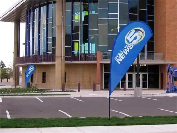
Feather flag placement
It is not just the design of your feather flag that helps it stand out in a crowd. Its placement also plays an important role. Here are some valuable tips to remember while deciding on the right spot for your feather flags:
- Avoid setting them up near trees, power lines, etc. Not only is the visibility reduced, but there is also the chance of the flags snagging and ripping away.
- Do not set up the flag in places with lots of things around it. You want to maximize the sign’s visibility. Keeping it amid other things will only end up with the flag getting lost, and remaining unseen.
- Supposing your establishment is in a busy place and you want to let people know about you through your feather flags. The best way to do this is by placing the flags in different spots.
Place them in those locations where they can be easily viewed from the road, like on fences, rooftops, or entryways.
- The most significant advantage of using feather flags is that you do not have to stick them to only one place. You can always move them around where you want and when you want. You can adjust the position based on how well it’s visible and getting seen.
These four tips are not so difficult to follow and implement in your feather banners. However, they do bring with them a marked improvement in the look and appeal of your flags.
Generally, remember that contrasting colors work best, less is more when it comes to text, and choose an easy-to-read font. But you don’t have to worry if you can’t choose your colors, font, and text.
There are many flag manufacturing companies like vancke.com offering free design services. They will help ensure you choose the right colors, font, and number of text and produce the perfect flag.