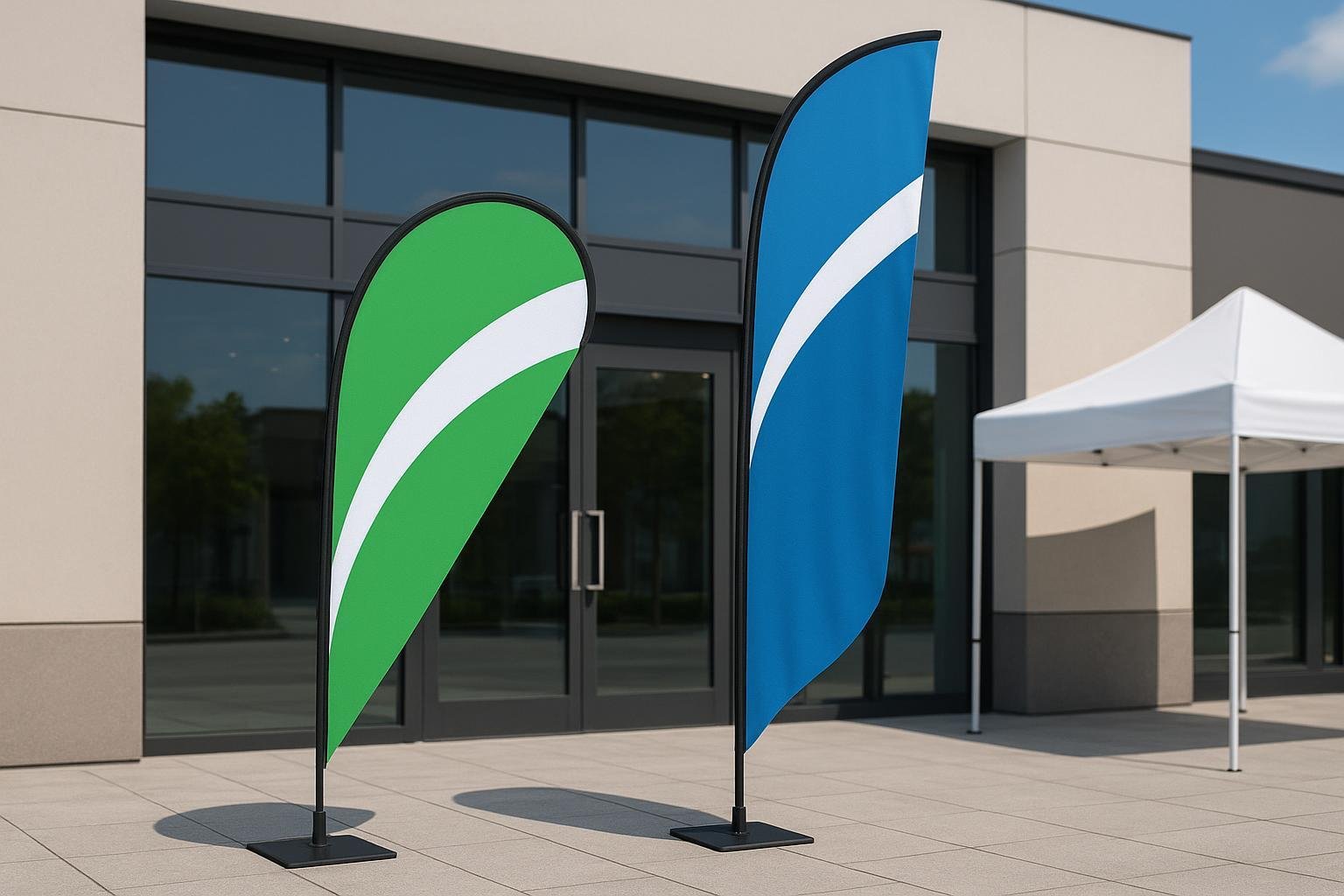
Teardrop banners are a versatile and impactful way to promote your brand or event. Their tall structure ensures visibility from a distance, while vibrant designs deliver messages quickly and effectively. These banners are weatherproof, making them reliable for outdoor use, and their lightweight design allows for easy transport. When you design a teardrop banner, you create a cost-effective marketing tool that stands out in any setting. This tutorial will guide you through the process, ensuring your banner is both professional and eye-catching. Whether you plan to design or buy teardrop banners, understanding their benefits is essential.
Choosing Tools and Templates for Your Teardrop Banner
Best Software for Designing a Teardrop Banner
Selecting the right software is the first step in creating a professional teardrop flag. Many tools are available, but some stand out for their ease of use and features. Popular options include:
canva
Snappa
Placeit
Pixlr
Glorify
When choosing software, prioritize ease of use. Drag-and-drop functionality and ready-to-use designs simplify the process. Look for tools with comprehensive features like photo editing and animation options. Cost-effectiveness is another factor. Affordable software can save you money on professional design services. Customer support is also important. Choose tools with multiple support channels, such as email or live chat. Integration capabilities matter too. Ensure the software works with CRM or email marketing tools if needed.
canva is a great choice for beginners. It offers industry-specific templates and a user-friendly interface. You can create custom teardrop banners quickly without advanced design skills.
Using Templates for Accurate Dimensions
Teardrop flag templates are essential for maintaining proper dimensions. These templates ensure your design fits the unique shape of the banner. Many software tools, including canva, provide pre-made templates. These templates save time and reduce errors.
When using templates, check the resolution and size specifications. High-resolution designs prevent pixelation during printing. Templates also help you align text and graphics correctly. This ensures your teardrop flag looks polished and professional.
Understanding Teardrop Banner Sizes and Shapes
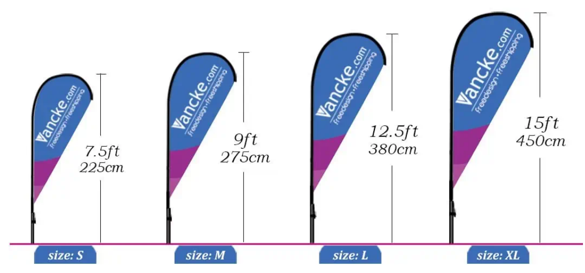
Teardrop flags come in various sizes, including small (7′), medium (9′), and large (11’2″). The size you choose depends on your display needs. Larger banners offer better visibility from a distance. Smaller ones work well for compact spaces.
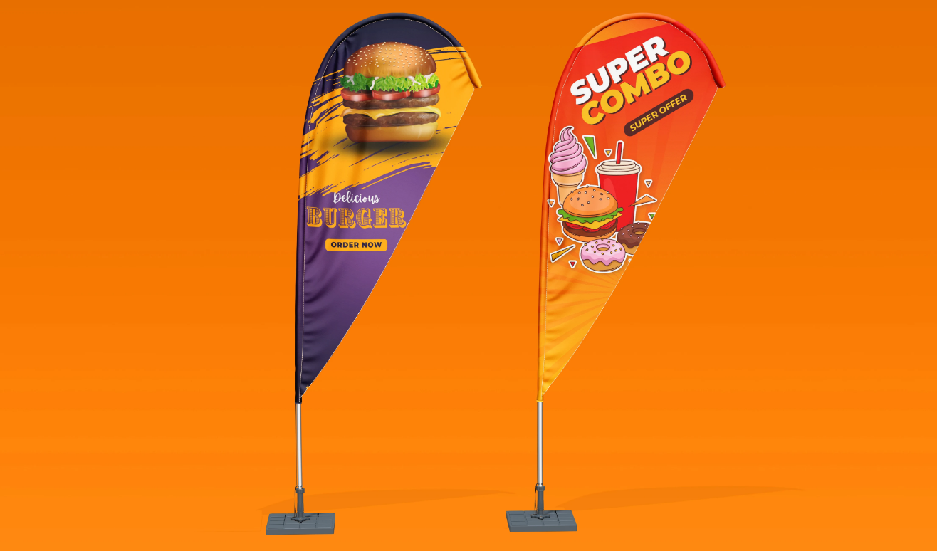
The teardrop shape itself captures attention instantly. Its curved design stands out in crowded areas. Use vibrant colors and simple graphics to enhance visibility. Double-sided printing can maximize exposure, especially in outdoor settings.
Custom teardrop flags should balance aesthetics and functionality. Keep the design colorful yet simple. Eye-catching graphics and contrasting colors work best. Templates can guide you in creating a design that complements the teardrop shape.
How to Design a Teardrop Banner
Planning the Layout for a Teardrop Flag
Start by brainstorming multiple design concepts. Think about how your teardrop flag will look from a distance. Use bold graphics and clear text to make it recognizable. Avoid cluttering the design with too many elements. A clean and simple layout ensures your message stands out.
Consider double-sided printing to maximize visibility. This works well for outdoor events or areas with high foot traffic. Before finalizing, create a preview of your design on a custom banner. This helps you spot any alignment issues or design flaws. A test print is also essential. It ensures the final product meets your expectations and looks professional.
Choosing Colors, Fonts, and Graphics
Colors, fonts, and graphics play a crucial role in making your teardrop flag visually appealing. Follow these best practices:
Use no more than two font styles. This keeps the text readable and professional.
Choose sans serif fonts like Futura or Helvetica for primary messages. Serif fonts work well for secondary details.
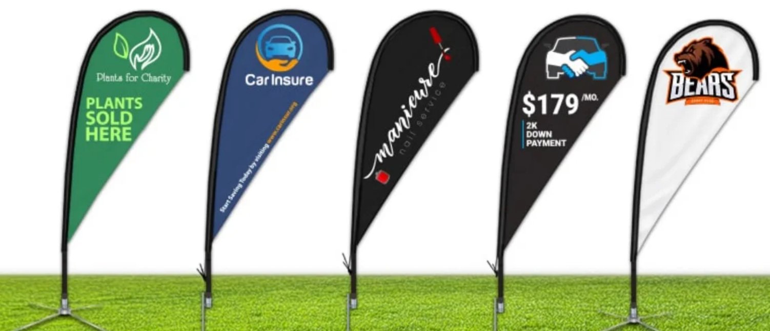
Select high-contrast colors. For example, pair a dark background with light text for better readability.
Keep the design simple. A minimalistic approach communicates your message effectively.
Consider using full-color photographs. These can convey your main message in a visually striking way.
The size of your teardrop flag also matters. Larger banners require bigger fonts and bold graphics to maintain visibility. Tools like canva make it easy to experiment with different color schemes and layouts.
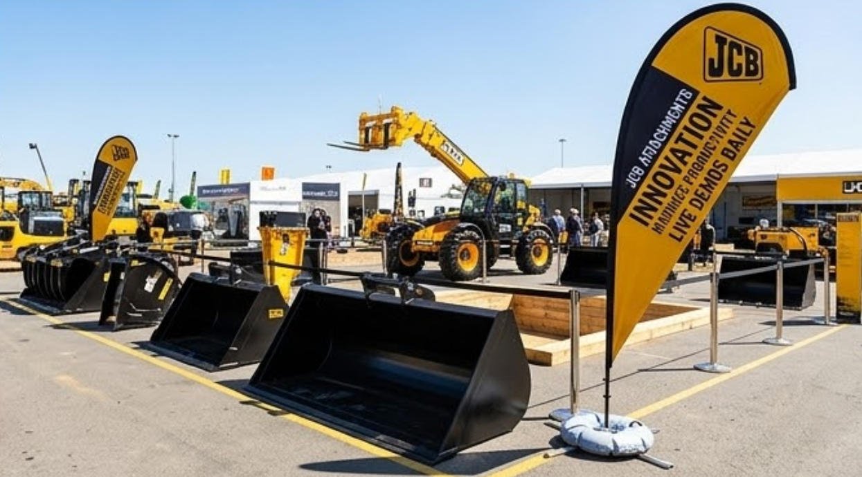
Placing Logos and Text for Maximum Impact
Positioning logos and text strategically ensures your teardrop flag grabs attention. Place the logo near the top of the banner. This makes it visible even from a distance. Use bold colors to make your message pop. Keep the text concise and easy to read.
Align your design with the event’s theme for better engagement. For example, if you’re promoting a summer event, use bright colors and playful fonts. Position your teardrop flag at entrances or high-traffic areas. This increases visibility and draws more attention to your message.
Strategy | Benefit |
|---|---|
Placement at entrances | Ensures maximum exposure to attendees. |
Use of bold colors | Makes messages stand out and attract attention. |
Positioning in high-traffic areas | Increases foot traffic and visibility. |
By following these steps, you can design a teardrop banner that effectively communicates your message and enhances your brand’s visibility.
Ensuring the Design Complements the Teardrop Shape
The teardrop shape of your banner is its most distinctive feature. To create an effective teardrop flag design, you need to tailor your layout to this unique form. Start by visualizing how your design will flow within the curved edges. Unlike rectangular banners, teardrop flags taper at the top and bottom, which means you must avoid placing critical elements near these areas.
Focus on the central portion of the banner. This is where your main message, logo, or graphic will stand out the most. Use vertical alignment to guide the viewer’s eye naturally from top to bottom. This approach ensures your design remains balanced and visually appealing.
When working with text, keep it concise and bold. Long sentences or small fonts can get lost in the curved design. Instead, opt for short, impactful phrases that are easy to read from a distance. Place your text in the middle section, avoiding the edges where it might appear distorted.
Graphics should also complement the teardrop shape. Choose images or icons that fit well within the curved layout. For example, circular or oval graphics often work better than square ones. If you’re using a background image, ensure it doesn’t overpower the main elements. A subtle gradient or pattern can add depth without distracting from your message.
Finally, test your design by overlaying it on a teardrop template. This step helps you identify any misaligned elements or areas that might look awkward when printed. Adjust your layout as needed to ensure every detail enhances the banner’s unique shape.
Previewing and Testing Your Teardrop Banner Design
Checking for Errors and Alignment
Before finalizing your teardrop flag design, carefully review it for errors. Check for spelling mistakes, incorrect logos, or misplaced graphics. These small issues can affect the banner’s professionalism. Use design software tools to zoom in and inspect every detail. Pay attention to alignment. Misaligned text or images can make your banner look unpolished.
Print a small-scale version of your design. This helps you spot alignment issues that may not be visible on a screen. Compare your printout to the teardrop flag template. Ensure all elements fit within the curved shape. Adjust any misplaced items before moving forward.
Testing Visibility and Readability
Your teardrop flag must grab attention quickly. Test its visibility by displaying it in different environments. Position it in high-traffic areas to see how well it stands out. Avoid placing it near obstructions like trees or parked cars. These can block your banner and reduce its effectiveness.
Check readability from various distances. Stand 10, 20, and 30 feet away to evaluate how clear the text and graphics appear. Use bold fonts and high-contrast colors to improve readability. If your message is hard to read, simplify the design. Shorten text or increase font size to make it more impactful.
Gathering Feedback for Improvements
Ask others to review your teardrop flag design. Gather feedback from colleagues, friends, or potential customers. They may notice issues you missed. Ask specific questions, such as whether the message is clear or if the colors are appealing.
Use their input to refine your design. Make adjustments based on common suggestions. For example, if multiple people find the text too small, increase its size. Testing and feedback ensure your banner is both effective and visually appealing.
Finalizing and Printing Your Teardrop Banner
Exporting the Design in the Right Format
Exporting your teardrop flag design in the correct format ensures a smooth printing process. Always save your artwork in a high-resolution format. This step guarantees that your logos and images appear sharp and professional when printed. Avoid using low-quality files, as they can result in blurry or pixelated prints.
It’s better to use high-resolution logos and images in your file because they look better when printed to give you a much better representation of your artwork. Saving artwork in PDF files eliminates any software requirement and compatibility headaches there may be with the signage company. It’s better to use Illustrator files saved in PDF because they look just like your Illustrator file.
If you’re using canva, export your design as a PDF with print-quality settings. This format preserves the quality of your design and ensures compatibility with most printers. Double-check the file dimensions and resolution before sending it to the printer. A resolution of 300 DPI (dots per inch) is ideal for large-format printing.
Communicating with Your Printer
Clear communication with your printer is essential for achieving the best results. Share your teardrop flag design along with any specific instructions. Mention the size, material, and whether you need single-sided or double-sided printing. Providing these details helps the printer understand your requirements.
Ask your printer about their preferred file format. While PDF is widely accepted, some printers may request other formats like AI (Adobe Illustrator) or EPS. If you’ve created your design in canva, confirm that the exported file meets their specifications. Discuss the turnaround time and delivery options to plan accordingly.
Reviewing Proofs Before Final Printing
Always request a proof before finalizing the print. A proof is a sample version of your teardrop flag design that allows you to check for any errors. Review the proof carefully for alignment, color accuracy, and text readability. Look for any discrepancies between your original design and the proof.
If you notice any issues, inform the printer immediately. Make the necessary adjustments in your design software, such as canva, and resend the updated file. Once you’re satisfied with the proof, give the printer your approval to proceed with the final printing. This step ensures your teardrop flag turns out exactly as you envisioned.
Designing a teardrop banner becomes straightforward when you follow a structured approach. Start by selecting the right tools and templates to ensure accuracy and ease. Focus on creating a clean, impactful design that aligns with the banner’s unique shape. Always test your layout for visibility and readability before finalizing it for printing. This tutorial equips you with the knowledge to create banners that stand out and effectively promote your brand or event.
Teardrop banners offer unmatched visibility and customization. Their sleek design adds sophistication to any setup, while vibrant colors and elegant curves enhance visual appeal. Positioning them in high-traffic areas or entrances maximizes their impact. Whether used for nonprofit events, real estate promotions, or educational campaigns, these banners deliver professional results.
Key Strategy | Description |
|---|---|
Visibility | Teardrop banners are designed to be highly visible, making them effective for brand exposure. |
Strategic Placement | Positioning banners at entrances or high-traffic areas maximizes their impact and visibility. |
Customization Options | Different sizes and designs can be tailored to highlight various sponsorship levels effectively. |
With this tutorial, you can confidently design a teardrop banner that captures attention and elevates your marketing efforts.