You want your trade show display to make people stop and take notice. The right design helps your tension fabric displays with custom tension stand out from the crowd. This not only boosts your brand but also creates a strong first impression. Professional graphics make your display easy to spot in a busy event hall. Many marketers emphasize that brand awareness is crucial for their event strategies. People tend to trust brands more when they see high-quality, custom tension fabric displays with eye-catching graphics. These displays attract more visitors and help you achieve real results. Use these design tips to capture attention and make a bigger impact.
Message Focus
Single Point
You want your display to grab attention fast. A focused design with a single, clear message helps you achieve this goal. When you highlight one main idea, you make it easy for people to understand what you offer. Research shows that a clear focal point, like a bold headline or a striking image, stands out first. People remember it. You can use size, color, or placement to make your main message pop.
Tip: Test your display by squinting at it or asking a friend for feedback. If the main point jumps out, your design works.
A focused design reduces confusion. It guides the viewer’s eyes and helps them process your message quickly. Logical organization around your focal point makes your display more effective. You want your audience to walk away knowing exactly what you do.
Make your main message the largest or brightest element.
Use supporting details only if they help your main point.
Avoid clutter. Too much information hides your message.
Concise Text
Short, simple text works best for tension fabric displays. People at events move fast. They do not stop to read long paragraphs. You need to get your message across in seconds. Focused design means you use only the words you need.
Use bullet points or short phrases.
Choose words that are easy to read and understand.
Remove extra details that do not support your main idea.
Studies show that concise text and clear visuals increase engagement. When you keep your message short, people remember it. They feel more interested in your brand. This approach unlocks the real value of your display and helps you stand out.
Readability
Font Choice
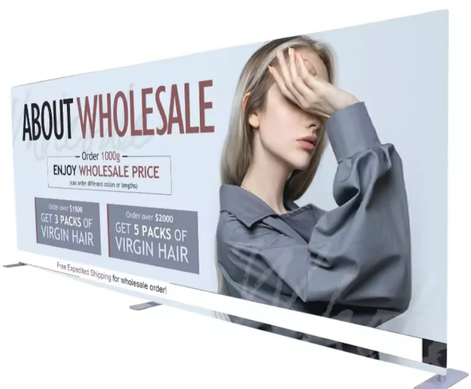
You want your message to stand out and be easy to read. The right font makes a big difference in your design. When you choose clear, simple fonts, you help people understand your message quickly. Sans-serif fonts look modern and clean. Serif fonts feel classic and trustworthy. Both can work, but you should avoid script or fancy fonts that are hard to read from a distance.
Studies show that font size, spacing, and style affect how people feel about your display. People often prefer larger, easy-to-read fonts like Arial in 12-point size. Even if two fonts have the same reading accuracy, people trust and remember displays that look sharp and clear. You want your audience to feel confident in your brand. Use one or two fonts only. Too many styles make your graphic design look messy.
Tip: Use bold or larger fonts for headlines. Keep supporting text smaller but still readable from several feet away.
Safe Area
You must protect your important text and images from getting cut off or distorted. Always keep key elements inside the safe area of your design. Place your logo, headline, and main visuals at least 1/4 inch inside the edge. This step prevents trimming errors and keeps your display looking professional.
In tension fabric displays, the edges can stretch and distort images. If you put text or graphics too close to the frame, they may look warped or even disappear. Always use a professional template and check with your printer. Add a bleed of at least 1/8 inch beyond the cut line so your design fills the space without losing any details.
Use a strong headline below the logo.
Add supporting images and information in the center.
Keep contact details or extra info near the bottom, inside the safe area.
A smart layout guides the viewer’s eyes and keeps your visual message clear. You want every part of your design to look sharp and professional at any event.
High-Quality Graphics
Resolution
You want your display to look clear and neat from all sides. High-resolution graphics help your booth get noticed by more people. Using the right resolution keeps your images sharp on big tension fabric displays. For best results, set your graphics at 72 DPI at full size or 200 DPI at half size. This helps your images stay clear and not look blocky.
Pro Tip: Always check your design at its real size before printing. Zoom in to see if any pictures look fuzzy or blocky. If you see problems, swap them for better images.
Good resolution makes your message stand out. You also need to use the right color profiles, like CMYK or Pantone coated, to keep colors bright and correct. Dye sublimation printing is best for tension fabric displays. This printing gives you bright graphics that last for many events. Remember to add a 0.25-inch bleed on every side and keep important details 1.5 inches from the edges. This step keeps your images and colors safe from being cut off or stretched.
Sharp Images
Sharp images catch people’s eyes and help them remember your display. You want every picture to look clear and full of detail. Blurry or bad images can make your brand look less professional. Always pick high-resolution graphics and do not stretch small images to fill big spaces.
Use images with strong contrast and bright colors.
Put your main picture in the center for the most impact.
Change all text to outlines so nothing is lost when printing.
When you use good images, your graphics look great under event lights. People notice the difference right away. Sharp images and bright colors help your brand stand out in a busy hall. You build trust and make people want to learn more about your products. Make your display stand out by choosing the best images and colors.
Brand Elements
Logo Placement
Your logo is the face of your brand. You want people to see it right away and remember it. Place your logo at the top of your tension fabric display for maximum impact. Studies show that logos at the top catch more attention and make your brand look powerful. This works best for brands that want to show strength and leadership. If your brand feels more friendly or approachable, you can place the logo lower, but always keep it clear and easy to spot.
A well-placed logo builds trust and helps people remember your booth. Think about famous partnerships, like the Ford car in a James Bond movie. The logo placement made the brand stand out and feel special. When you use smart logo placement, you boost your branding and make your display more memorable.
You should also make sure your logo is sharp and large enough to see from a distance. Use high-resolution images so your logo looks crisp and professional. Avoid putting your logo near the edges, where it might get cut off or stretched.
Place your logo at eye level or higher.
Keep it away from the edges.
Use a size that stands out but does not overpower your message.
Consistent Colors
Consistent use of color is one of the most effective branding strategies for events. When you use the same colors in all your displays, you help people remember your brand. Research shows that color grabs attention faster than shapes or words. People remember brands better when they see the same colors every time.
Tip: Use high-contrast color combinations, like white on red or black on white, to make your message pop.
Big brands like McDonald’s and KFC use the same colors everywhere. This makes their branding strong and easy to recognize. You can do the same with your tension fabric display. Pick two or three main colors that match your brand. Use them for backgrounds, text, and accents. This creates a unified look and helps people connect with your brand.
Choose colors that match your logo and brand style.
Use the same color scheme for all your event materials.
Make sure your colors look bright and clear under event lighting.
When you use consistent colors, you make your booth stand out. People will remember your display and your brand long after the event ends.
Eye-Catching Designs
Bold Colors
You want your booth to get noticed in a busy place. Bright, bold colors help your display stand out. Using strong colors makes people look at your booth from far away. Studies say colors can help people remember brands better. Red is a color that grabs attention quickly. Color psychology is important too. The right color can change how people feel and where they look first.
Bold colors and fonts make your message stand out.
Bright colors show off your most important details.
White space around bold colors keeps things easy to read.
Big graphics look best with bold colors. These colors make your booth easy to spot from far away. You want people to remember your booth after the event. Picking bold colors helps your brand be special and connect with visitors.
Tip: Use bold colors for your main message or call to action. This helps people see what is important and makes them want to check out your booth.
Contrast
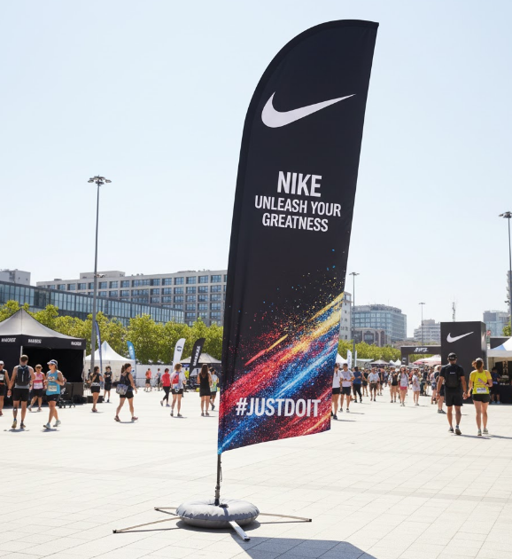
Strong contrast makes your design easy to read and nice to look at. High contrast between words and background helps people read faster. You want your message to be clear, even when it is busy. Brands like Coca-Cola and Nike use high-contrast colors to make their displays stand out.
Use dark words on a light background or light words on a dark background.
Mix different colors to show what is important.
Make important things stand out by using contrast.
Research shows that changing contrast helps people see graphics better, especially on big displays. Scientists have studied how our eyes see different contrasts. Their work helps you make graphics everyone can see. The Web Content Accessibility Guidelines say strong contrast makes displays easier to read for all.
When you use contrast well, you help people focus on your message. Your display becomes more interesting and works better. This helps you get good results at any event.
Lighting & Placement
Spotlights
You want your tension fabric display to look great at any event. Good lighting helps your booth stand out and brings people over. Spotlights can show off your main message, logo, or product. When you use spotlights, your graphics are easier to see and colors look brighter. Good lighting also makes your booth look more professional and friendly.
Put spotlights above or below your display for a strong effect. You can move the lights to shine on different parts of your booth. This lets you change how your booth looks at each event. Many trade show experts say LED spotlights are best. They are bright, save energy, and are simple to set up.
Tip: Try out your lights before the event starts. Walk around your booth and look for shadows or glare. Move your spotlights until your graphics look clear from every spot.
Lighting does more than just make your booth bright. It gives visitors a cool visual experience. When you use spotlights with bold graphics, your booth gets noticed and draws more people in.
Eye Level
You want your graphics where people look first. Putting your main images at eye level helps people notice your brand. Studies show people look longer at displays set at eye level. This means more people will ask questions or buy things.
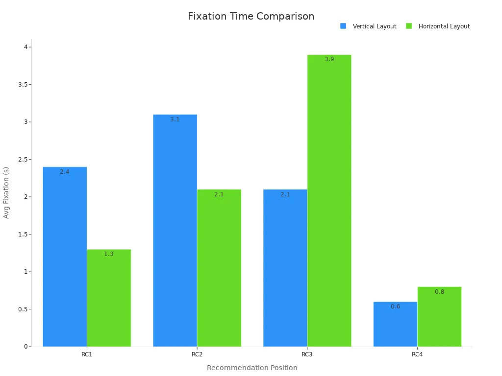
The chart above shows people look longer at vertical displays at eye level than at horizontal ones. For example, people looked at key vertical spots for 3.1 seconds, but only 2.1 seconds at horizontal spots. Displays at eye level also led to almost twice as many purchases. So, always put your most important graphics and messages where people’s eyes go first.
Follow these steps for the best setup: Place your main message and logo at eye level. Use spotlights to light up these spots. Check your booth from different sides to make sure everything is easy to see. Move things if you see blocked views or dark areas. Do this every time you set up your booth.
When you use good lighting and smart placement, your booth stands out. You help more people see your display, visit your booth, and remember your brand.
Custom Tension Fabric Displays
Interactive Features
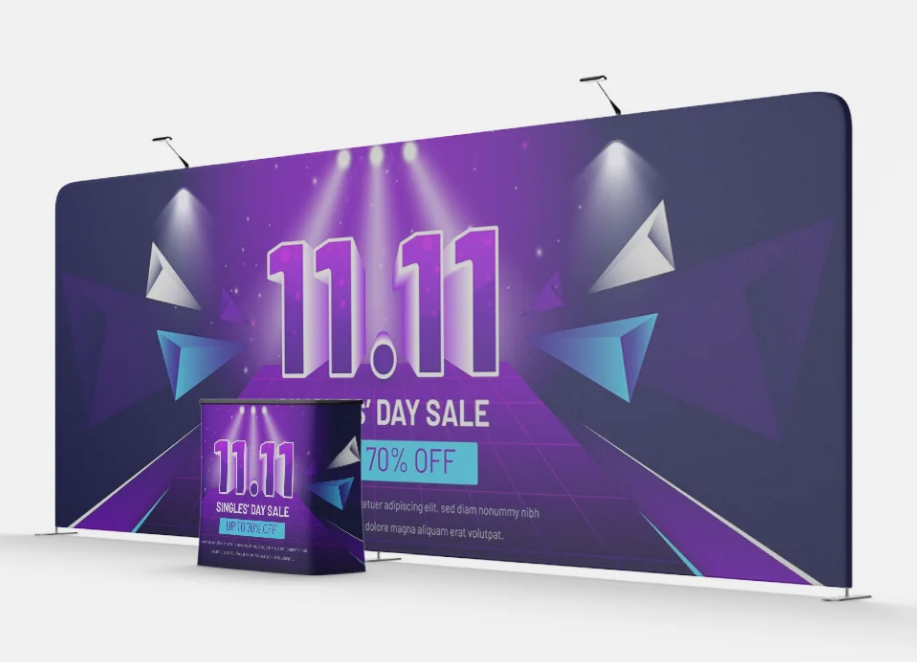
You want your booth to be special and keep people interested. Tension fabric displays with custom tension let you add fun features. These features help your booth stand out. You can use stretch fabric and velcro-backed materials. This makes setup fast and lets you change graphics easily. You can switch your message or design in just a few minutes. This keeps your display new and fun.
Add LED lighting to your tension fabric display frame. Lights make your main message bright and colorful. LED lights also use less energy and last a long time. This makes your display look cool and saves power.
Use digital screens or interactive panels. Visitors can touch, swipe, or watch videos. This turns your display into something people want to try. Moving banners or small animations get attention and help share your story.
Try AR or VR features. These let people see your products in 3D or take a virtual tour. You can also find out how many people use your display.
Customizable graphics and bright lights turn your tension fabric display frame into something modern and fun. You make moments people remember. This helps more people know your brand and talk about your booth after the event.
Installation Steps
Setting up your tension fabric displays with custom tension the right way is important. You want your display to look smooth and neat. Wrinkles or gaps can make it look bad. Start by taking out your tension fabric display frame. These frames are light and easy to carry. You can move them without trouble.
Put all the parts out and check your customizable graphics for damage.
Build the tension fabric display frame by snapping the pieces together. Most frames use a simple click-and-lock system.
Pull the fabric over the frame. Make sure the graphics match the edges and important spots.
Hold the fabric tight with velcro or zippers. This keeps your display smooth and tight.
Add lights or digital features if you need them. Test everything before the event starts.
Tension fabric displays with custom tension are easy to move. You can pack them up fast and go to your next event. The light frame and easy setup save you time and work. When you set up your display the right way, it looks perfect and brings people over to your booth.
Tip: Always practice setting up before the event. This helps make sure your tension fabric display frame fits well and your graphics look great.
You want your trade show display to shine at every event. Use these tips to create a display that grabs attention and builds your brand. A great trade show display uses clear graphics, bold colors, and smart lighting. Place your display at eye level and add interactive features for more impact. If you want the best results, ask a pro for help or explore more resources.
Take action now. Make your next display the one everyone remembers.
