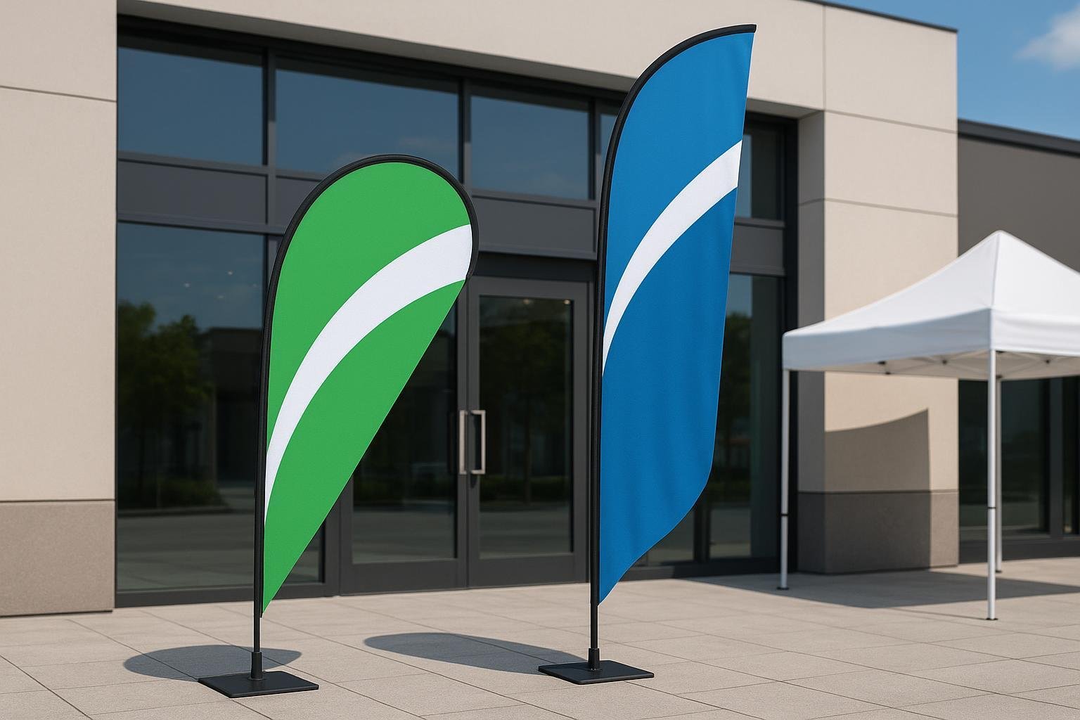
It is great that you’ve finally got yourself to put up pop up A-frame flags to advertise about your carwash. You will not repent your decision because it will keep you busy washing cars for a long time!

However, there is one small hitch to remember. It works only with the right design. Poorly designed pop up A-frame banners is as useful as having nothing at all in front of your carwash.
You need something interesting and convincing enough to at least make people want to learn more about your car wash packages and services. This means that you should work at giving them a reason to take a good look at your banner.
It is not enough to just print a few words and images onto the banner. You need to come up with something unique and attractive. This is best done while keeping these few points in mind.

Use your brand for inspiration
It is your brand and name that can and will make people enter your carwash. Especially if they already know how well you can wash their cars. So make sure you use the same colors and font you feel will truly reflect you and your brand. If you already have your brand colors and font, then use them in your pop up A frame flag.
Come up with the right message
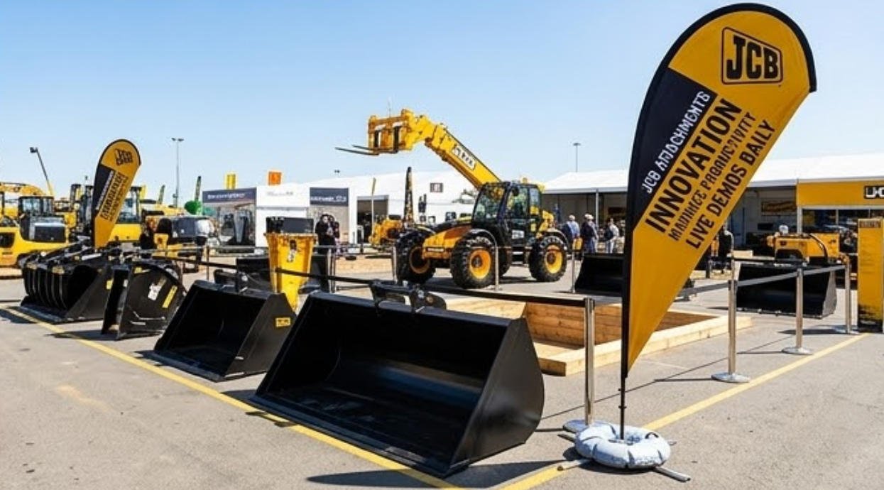
With the colors and font, you also need to use the right words that drive the correct message into prospective customers. Now if you wonder what the right message is, it is the reason for your making a horizontal A frame banner stand in the first place.
It could be something extra you are offering with a car wash like a free or new type of polish. Or the banner could be to inform people about the opening day of your business. Or it could perhaps be used to mark your business’s first anniversary or a special offer.
Whatever it is make sure you drive the right message through. There is something else to remember though. Do not get carried away and come up with something long and flashy.
Something short and sweet is always a better option. This is because the flag is easier to read if there is not too much printed on it. Besides, you only have a few seconds to gain your passers-by’s attention.
How much do you expect an average person to be able to read in a few seconds?!

Print and use the right images
It is when you choose your message that you can select the appropriate images to complement it. Look for, and use high-quality images that have a good resolution.
This is necessary because low-resolution images end up looking blurry on the pop up A frame banner.
Who likes a blurry imaged banner? It reflects poorly on your establishment and makes you look unprofessional.
Just like the message, use minimal images because you do not want to end up overcrowding your banner. As a car wash station, you naturally will want to use pictures of some cars or perhaps soap suds or a sponge on the banner.
The choice is left to you but just make sure you do not put in too many unnecessary images. Use enough to create an impact. Besides, your banner should look attractive and interesting enough for people to read it.
Use readable text
Yes, you now have got your message and your images. It is next time to select the right font to use for the text. You can’t just use the first one that you find on the computer.
Use something clear and readable, and relevant to your car wash business. For example, the gothic font is more suitable for something historic or a historically themed party.
It, however, is not a suitable choice for your car wash banner.
The best choice is usually a sans serif font that is printed using a bold typeface. Of course, you can always bend the rules and use any other font you feel will look best for your flag.
Choose the right colors to highlight it, and make sure the end result is readable words. As mentioned earlier, do not overcrowd the banner. Disclose enough information to pique your customers’ curiosity and make them want to use your car wash.

Useful color coordination tips
The color wheel poses a myriad of color options to use for your pop A frame flags. Here they are:
Black
Black is a sleek but sophisticated color that is very popular with the brand advertising sector. The reason is that this is a color that blends well with practically any color. It is because the color has so many associations and meanings.
It can be associated with power, formality, greed and even evil. While these adjectives may seem intimidating, do not let them frighten you. This is a traditional color that complements and blends well with most colors.
White
White is another color that goes well with most colors. It is projected better if it has a boundary or border in another color. White is used to signify purity, cleanliness, honesty, and simplicity in business.
They are all the qualities you may want to promote in your car wash too.
Gray
Gray is a common color used in the branding for many industries. It is a color with deep associations in various segments. They range from science to cold temperatures to balance, calm and maturity in life.
Red
If you want to show deep or strong emotions in your flag, then red is the color to use. It can clearly depict the anger, excitement, and pleasure a car owner feels after getting their car washed in your establishments.
Besides, red is a color that is popularly associated with power, attractiveness and even speed. There are many cases where it is proven to even help stimulate the appetite.
This may not be a helpful significance to use in your horizontal A frame banner stand. Besides, red is not always used to display costiveness, which is why it’s better to moderately use it in your banner.
Orange
Now, this is a positive color associated with happiness and vitality in life. This is a friendly, energetic and inviting color like yellow. It is not an overpowering color like red is. It is a color that is best used to display your car wash’s playfulness and simplicity in washing your car.
Yellow
This is a color that depicts positivity and life and is associated with motivation and creativity. This is a useful color if you want to create a flag that garners maximum attention to your business. But beware! Many people complain that its regular display can end up irritating to you mainly because of its reflective nature.
Blue
Blue is a good choice for your banner. It is a popular color used in most advertising and media. The reason why is because this is a color associated with integrity, elegance, truth, and clarity.
The sight and presence of the color put people at ease. You can use a darker shade if you want to describe the masculinity of your car wash. The subtler shades, however, are most commonly used to show a sense of calm.
Green
Green is considered, and popularly known as a calming color. It also has associations with growth, freshness, health and nurturing. Some people use it in deeper shades to show an association with wealth.
You can, however, use a lighter shade if you want to show a new beginning, like when you want to advertise about your new car wash service.
Purple
Purple is an interesting color and should be used after lots of thought and consideration. This is because it is a mysterious color that is related to spirituality and magic.
It is also considered to be a sophisticated color, associated with luxury, elegance, royalty, and wisdom. You now know which color to use if you have something special to advertise through your pop up A frame banner!
Pink
This may not be a good choice for your banner. It’s because this is considered to be the most feminine color associated with love and tenderness. Now, these are two words you do not associate with a car wash.
The color is more commonly used in products associated with women and young girls. It can also be used to depict friendship and beauty.
Brown
Brown can be used if you want to advertise a new car wash for leather car seats. This is because the color is associated with anything natural like wood and leather.
It also depicts strength and durability. You can use it to balance out stronger colors. But make sure you use it limitedly because too much of brown only gives your brand a dirty look.

Mistakes to avoid while printing pop up A frame flags
No matter how well you think you have coordinated colors, or how well you think your design may be. There is always the chance of making mistakes because heck, you are a human being!
Remember, to err is human!
However, prevention is always better than cure.
So here are a few common printing mistakes that may occur while you print your banner. Knowing them can help you prevent them from occurring, and wasting your time and money.
Double-check
Sometimes no matter how thoroughly you may have checked your text you still end up with grammar or spelling mistakes. You must double-check your proof before sending it for printing.
If not, even a small grammar mistake can lead to people distrusting your work and company. All the designs and colors you may have in the banner will be sidelined. Besides, people may also ridicule you for your spelling mistakes.
It does not hurt if you even show your proof to a few people before sending it for printing. Remember, the more pairs of eyes you have checked it, the more mistakes they can find. Sometimes they notice things that you may have missed.
·Have you added your contact information?
Yup! This may be hard to believe. But many people forget to include their contact information despite it being such an important part of the pop up A frame flags.
It is especially important if you will be putting up the banner someplace other than your car wash. For example, if you use it trade shows or sports advertisements to let people know about you.
Your banner must have at least your address, one contact phone number, and your website if you have one. If you want to target an online audience, then it’s worth including a link to your social media profile too. It is acceptable if you forget one of these in your banner.

However, forgetting them entirely is not at all acceptable.
Is the pop up A frame flag too crowded?
Do not make the mistake of crowding too much information into your banner. You only end up confusing readers instead of enlightening them about your car wash services.
This means that your company history and testimonials from past customers, along with numerous images, don’t belong here. They should be a part of your website and not a part of the banner.
Keep your banner as simple as possible. Remember, passers-by have only a few seconds to absorb whatever you have to say through the flags. Make sure you enlighten them and let them know about you and not get them confused.
·What about aesthetics?
Your flag should be colorful and informative but to a limit. Too much information is overwhelming and too much of graphics and colors spoil its aesthetics.
No matter how well you may think a design is, it is better to get a few opinions to decide if is worth including in your banner or not. Remember, the right colors and designs can do wonders to your car wash business!