[lwptoc numeration=”none”]
Custom advertising flags are one of the most effective traditional advertising models. It’s an incredible way to advertise your brand, business, or whatsoever you want to promote. You can use them for indoor & outdoor events for brand awareness or market a particular service/product. All it requires is a solid logo that must be eye-catching and match your brand’s motto, and for that, “Vancke custom adverting flags” is here to walk you through the most effective steps to create a logo design.
The logo is the key element of a custom advertising flag design that enables your business to enhance conversion rates and acknowledge more brand awareness. A compelling logo makes a custom advertising flag complete and ready to market your business’s message. Your business needs a distinctive logo that can convey the business message to enhance the impact of its advertising flags campaign.
Secret Tips to design a logo for custom advertising flags
This blog will show you how to design a compelling logo for custom advertising flags. Let’s go through the enlisted secret tips to design a professional logo for your company.
Define Your Business
A professional logo can communicate with the targeted market. But, for designing such a logo, you must first define your business. A better understanding of a business model can lead to a compelling logo design. What is your business trying to sell? What is the targeted audience of your brand?
What makes your business exceptional? Once you get to the point that makes your business unique, it will be much easier to design a logo that aligns with your business.
You may ask questions to yourself as listed below for a better understanding of business,
- What is the end goal of this business?
- What beliefs are significant for your company to stay in business?
- What makes our business/brand unique?
- What are the pain points of our targeted market?
Brainstorming
Now, when you understand your business better, you can define your business/brand in a sentence. It’s time to brainstorm on logo design. The sky is the limit if you’re looking for the best logo design to make your custom advertising flags more effective. It might seem daunting to many, but it does not have to be if you initiate the logo design procedure through healthy brainstorming.
It’s significant to take some time to brainstorm and think about diverse ideas. Such as what colors you want to use, what message you want to convey through your logo, what you are looking to achieve, and what feelings you want your flag to highlight the most.
Follow the enlisted tips for adding value to the brainstorming process and get the best ideas,
- Walk in your customers’ shoes; thinking as your audience will lead you to the best ideas.
- Involve your friends, business partners, and all the departments of your company in this process. The increasing number of perspectives will get you a diverse range of ideas.
- Talk to your targeted audience through social media platforms to better know how they think about a specific product or service.
If you are stuck on where to start, try looking at some great examples of flags for inspiration through Google search, which is the best option to get an idea, or talk to the Vancke flag designing experts to enjoy free consultancy and flag designing services.

Look at your competitors
Borrowing ideas from your competitors is not a bad idea. Look how they are representing their products or services. Analyze their performance, the impact of their logo design on marketing, and logo alignment with brands’ pitch lines.
Looking at competitors’ strategies does not mean stealing their strategy; rather, it will give you a direction to brainstorm. After analyzing competitors’ logo designs, brainstorm to get a design idea that keeps you relevant but in a unique way.
Sketching
Sketching the ideas, you have brainstormed; will be more beneficial than keeping them in your mind. Don’t worry about drawing the brainstormed designs perfectly; rather, get your ideas down on paper. Once you get a few sketches you like, you can initiate the refining process as you want.
Take time to pick the precise and compelling shapes and colors that can represent your business. Stick to one perfectly chosen color palette to make a professional logo sketch. This trick is very important when you start designing your logo digitally. Also, keep your design as simple as possible because using too many colors or creating complicated shapes will make it tricky to align with the business message.
Feedback
After drawing multiple sketches on paper or in any software, pick up the best three or five drawings to share with friends, family, business partners, and your company’s departments.
Ask for their honest feedback on the proposed logo sketches; their feedback will be crucial to lead you in the right direction. Use their input to develop a final sketch for your brand’s logo.
Pick the right color
After developing a finalized sketch for your advertising flags logo, it’s time to find the appropriate color palette that can represent your business. Picking up the right color is the most crucial step in designing a compelling, unique, and business-relevant logo. Colors have different meanings; using the wrong color can discredit all your branding and marketing campaign efforts.
Color can trigger human emotions; you need to pay attention to pick the right color palette for your business logo. Colors psychology is complex; it may be tough for you to choose an ideal color palette to trigger your audience’s relevant emotions. You may go through the following list to better understand the logo colors meaning. It will ultimately guide you in choosing the perfect colors for your logo.
- Orange – Orange is a vibrant and refreshing color. It can be your top choice if you’re running a food-related business as it is known for arousing hunger, along with red and yellow colors.
- Red – Red indicates excitement, intensity, and fury. It can be a great choice if your business targets youth and wants to stand out.
- Yellow – It sets a friendly, affordable, and energetic tone for a business.
- Blue – Blue is riggers a quite popular and traditional color. It triggers a sense of calmness and assists businesses in establishing a connection with the targeted audience.
- Green – Green represents nature and prevails a sense of serenity. If your business relates to nature or the environment, you must place it in your logo color palette.
- Purple – Purple is a feminine color that can give brands a luxury touch. If your business features luxury services or products, you may add purple into the color palette for your brand’s logo.
- Pink – How can you forget the pink color if your business offers girls-related services or products? Pink is a calm, cool and girlish color that can do magic for businesses, targeting a female audience.
- Brown – Brown may not feel an ideal choice for a brand’s logo at first, as it hints at loneliness, isolation, and sad feelings. But it can work for businesses dealing in classic, vintage, or handmade products. Because brown also indicates a sense of security, dependability, and resilience.
- Black – It is a symbolic color for the indication of power, sophistication, grace, and mystery. Fashion brands generally use black in their logo as it’s much popular and attractive color. And it can easily fit in most color palettes to make them complete.
- White – White color prevails the sense of peace, cleanliness, and purity. Western cultures use it in weddings, hospitals, and to represent angels. In contrast, eastern culture links it to sadness and uses it on death. But calmness and cleanliness are the common factors defined by the white color. You can use white in your logos to balance the voice of your brand messages.
- Gray – It is a combination of white and black colors. Generally, brands use gray in their logo to get a classic look. Dark gray can give a mysterious look to a brand, while light gray can act as a balancing factor.
All the above-discussed colors come in a diverse range of shades; every shade may have a varying meaning. That means you must be careful when choosing the right color palette for your business. It can make or break all your marketing and branding efforts.
Pick the right font
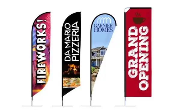
Picking up the right font is as much crucial as choosing the right color for a logo. You may have to pick one of the following four font families to convey your message to the targeted audience precisely.
- Serif fonts – This font family gives a classic look to a message; you may choose this font family for your logo line if your business deals with classic or traditional products.
- Sans-serif –It indicates a modern look of business; It can be a perfect choice for brands dealing in contemporary products or services.
- Script fonts – Script fonts are similar to handwriting. There is a huge variety of fonts in a script font family. You can use this font family in your brand’s logo to indicate the individualized experience ensured by your business products/services.
- Display fonts – Display fonts are decorative, stylish, and attractive; fashion brands or businesses with iconic brand-image use this font family to electrify their voice.
Finalize your design
It’s time to combine all the elements (sketch, shape, color, and text) into a logo designing tool like Canve or illustrator.
Adobe Illustrator can be your choice to create a clean, scalable version of your logo. But you may go with Canva or hire a logo designer if you’re a newbie to logo designing software.
Make some final touches to your design, and that’s it! By going with these steps, you will have a great logo for your custom advertising flag. You can also consult with Vancke professional custom flags designers’ team to make this process easier and speedy for you.

