Why Your Pop-Up A-Frame Banner Gets Seen but Not Used
A pop-up A-frame banner can be perfectly printed, easy to carry, and still fail at the moment it matters: a visitor sees it, slows down, and does not know what to do next. The result is a display that receives attention without moving anyone toward registration, a product conversation, a retail area, or the next event checkpoint.
This is usually not a visibility problem alone. It is a customer-journey problem. The banner is doing the job of a logo, a location marker, a directional sign, and a full explanation at the same time. When the message and the placement do not agree, staff have to repeat the instruction, visitors hesitate, and the printed surface becomes expensive background rather than a useful prompt.
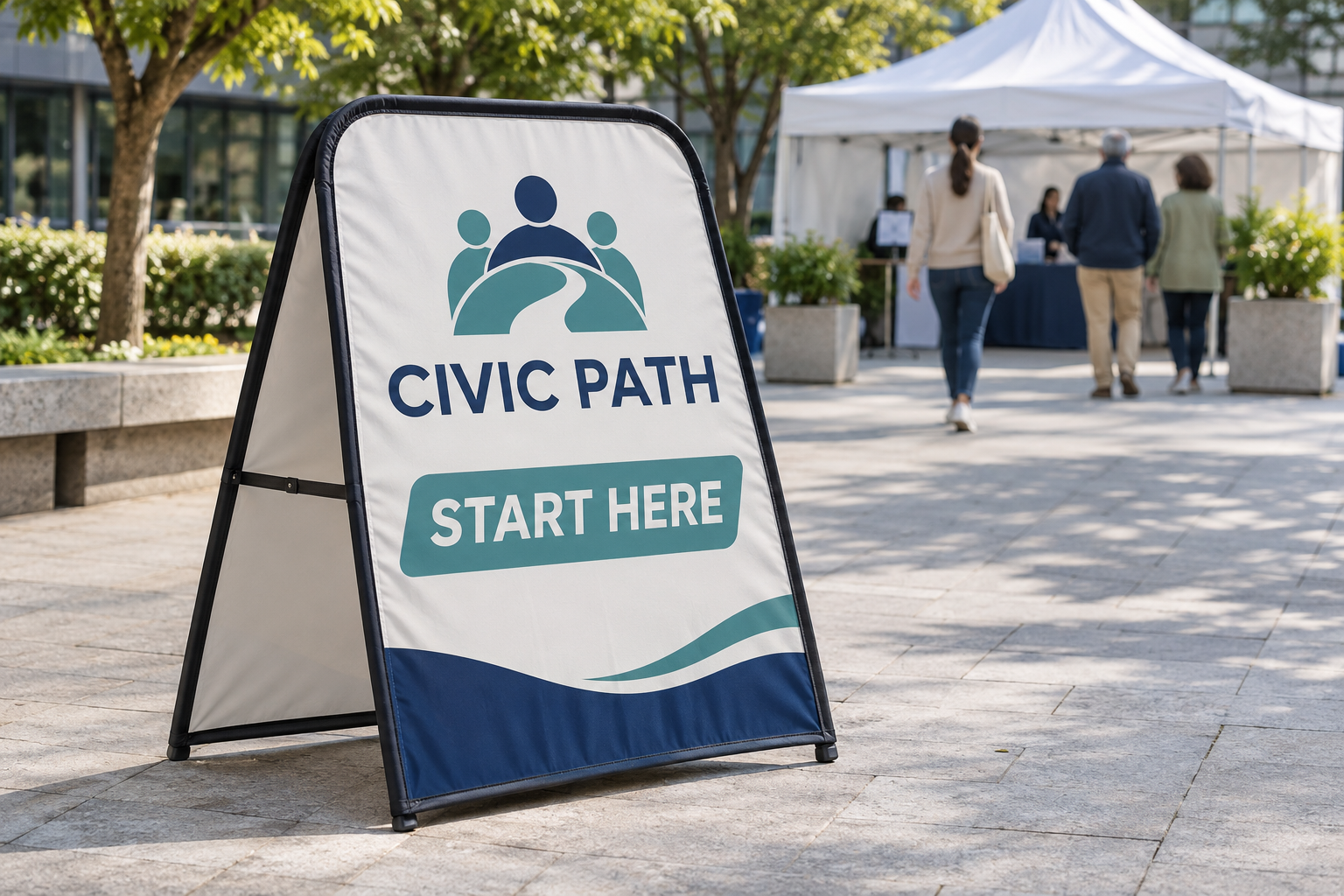
Vancke describes its pop-up A-frame banners as portable displays with custom printed graphics for events, sports, retail, and promotional environments. The display folds for transport and can be used with a carry bag and ground pegs for relevant outdoor setups. The product can support the journey, but the brief still has to define the journey. Use the checks below before you approve artwork or request a quote.
The pain is hesitation, not a lack of attention
Start by describing the moment after the glance. Does the visitor need to enter a tent, walk to a registration desk, find a demonstration, ask for a sample, or join a queue? If the answer is not obvious, the banner is carrying a vague communication task. A short brand name may help people recognize the organizer, but it does not tell them how to continue.
Write the intended action as a verb: check in, enter, ask, follow, or find. Then write the destination as a noun: registration, product demo, information desk, entrance, or collection point. This gives the artwork a functional standard. The question is no longer “Does the banner look attractive?” It is “Can the right person understand the next step while moving through this space?”
Diagnose the missed action before changing the design
When a display is not helping visitors act, do not immediately add more copy. First identify which part of the journey is failing:
- Recognition: Can the visitor tell which event, business, or activity the sign belongs to?
- Direction: Can the visitor tell where to go from the banner?
- Timing: Does the message arrive before the decision point, or only after the visitor has passed it?
- Permission: Does the wording make the next step feel open and expected, rather than private or restricted?
- Confirmation: After moving, can the visitor recognize that they have reached the correct place?
One A-frame should not be forced to solve every stage. If it sits before a turn, its primary task may be direction. If it sits beside a table, its task may be confirmation. If it sits at the entrance, its task may be recognition and invitation. Give each unit one main job, especially when several banners are used together.
Put one next step on the printed surface
The safest customer-pain-point correction is to reduce the decision to one clear next step. “Start here,” “Check in this way,” and “Find the demo” are examples of action language; the exact wording should come from the event team and the destination. Keep the brand or event name visible, but do not let it compete with the instruction that moves the visitor forward.
Use a short supporting line only when it removes a real question. A clinic may need the appointment type. A retail activation may need the product category. A sports event may need the registration group. If the supporting line does not change what the visitor does, it is a candidate for removal.
Do not promise a route the venue cannot support. If the message points left, the route must remain open and identifiable. If the instruction depends on a staffed desk, the team should know who owns that desk and what happens when the queue changes. The printed message and the operating plan must agree before the proof is approved.
Place the A-frame before the decision point
A sign placed directly beside a destination may be easy to photograph but too late to guide anyone. Place it where a visitor still has time to choose a direction. For a market, that may be outside the entrance. For a community event, it may be before the check-in queue splits. For a sports venue, it may be where participants first see the lobby route rather than at the registration table itself.
Map the approach in three positions: where the visitor first sees the banner, where the visitor decides, and where the visitor completes the action. At each position, note what can block the message: people, cars, tables, doors, merchandise, or another sign. A portable display is useful because it can be moved during setup, but that flexibility only helps if someone is assigned to inspect the route after the venue is populated.
Match the message to the visitor’s movement
A visitor walking past a display has less time to interpret it than a visitor standing in front of a staffed table. The artwork should match the speed and distance of the approach. A moving audience needs a short headline, strong contrast, and a visible directional cue. A waiting audience may have time for a secondary detail, but the primary action should still be obvious.
Review the design at the actual approach distance. Ask someone who did not write the brief to answer three questions without explanation: What is this? Where should I go? What should I do next? If the answers are vague, the issue is not solved by adding a paragraph. Rework the hierarchy and test again.
For an advertising production company, distributor, or print shop preparing several customer versions, keep this test separate from brand approval. A customer may approve a logo and color palette while the event team still has not approved the route. Both approvals belong in the project record.
Design for both sides of the route
Many event paths are not one-way. Visitors may approach from the entrance, return from a service point, or cross the display from the opposite side. Decide whether the same message must work in both directions before the artwork is finalized. If the back face will be seen, do not treat it as leftover space.
Vancke’s product information describes custom printed graphics and multiple display formats. Ask the supplier to confirm the suitable configuration for the intended route and whether the front and reverse should carry the same or different message. The important decision is not to add copy everywhere; it is to make sure the visitor does not lose the instruction when the path changes.
When the two directions have different jobs, label the artwork files and proof notes clearly. For example, one face may invite people into the event while the reverse confirms the way back to the exit or collection point. The team should know which face belongs to which approach before the display reaches the venue.
Plan the physical setup before approving the proof
The image on the proof should show the banner in its working environment, not only as a flat artwork file. Confirm the available floor area, the approach direction, the surface under the feet, the nearest obstruction, and who can move the display if the route changes. For outdoor events, include the venue’s own weather and safety plan in the setup decision. The National Weather Service’s Event Ready Guide is a noncommercial planning reference for coordinating weather information and safety decisions; it does not replace the event authority’s instructions.
Ask for the recommended setup details for the actual location. Vancke’s product page identifies ground pegs and a carry bag as part of the display context, but the correct arrangement still depends on the surface and the venue’s rules. Do not assume that a product photo answers an installation question. Put the floor, route, and operating responsibility in the inquiry.
Run a five-minute visitor test
Before the event opens, use a simple test that costs less than a reprint:
- Place the banner at the intended approach point.
- Ask a teammate who has not seen the brief to walk the route normally.
- Stop them at the first point where they would make a decision.
- Ask what they think the banner wants them to do.
- Move the banner or revise the message, then repeat the test.
Record the final placement with a photo and keep the approved wording beside the production proof. This protects the handoff between the person who ordered the display, the person who approved the artwork, and the person who sets up the venue. It also makes the next order easier because the team has a tested use case rather than a generic request for “an event banner.”
Send a quote-ready brief that describes the pain
When requesting a quote, include the problem the display must solve, not only the product name. Send:
- the visitor action that is currently unclear;
- the exact destination and the approach direction;
- the first point where visitors must choose a route;
- the primary headline, brand name, and any essential supporting line;
- whether the reverse face needs the same message or a different job;
- floor surface, available footprint, obstructions, and indoor or outdoor use;
- quantity, number of artwork versions, and proof approver;
- event date, required-arrival date, destination, and latest proof deadline.
Review Vancke’s artwork requirements before sending files. If the artwork is still being decided, say so. A clear “message pending” is more useful than a rushed file that later needs to be replaced. If the customer needs design support, Vancke’s FAQ describes its in-house design assistance; confirm the available service and timing for the specific order.
Turn attention into the next useful action
A pop-up A-frame banner is doing useful work when it helps the right visitor recognize the event, understand the next step, and reach the correct place with less hesitation. That outcome depends on the message, the route, and the proof—not just on ordering a portable display.
Start with one customer problem: “Visitors see our event but do not know where to check in,” or “Shoppers notice the activation but miss the entrance.” Then define one action, place the banner before the decision point, test both approach directions, and document the final setup. When the brief is ready, send the route, artwork status, quantity, and required-arrival date through Vancke’s contact page so the team can recommend the appropriate configuration and prepare a quote-ready proof.