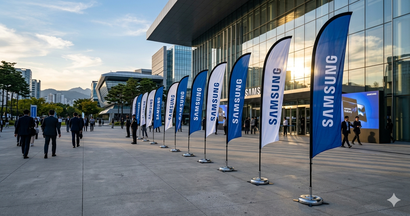
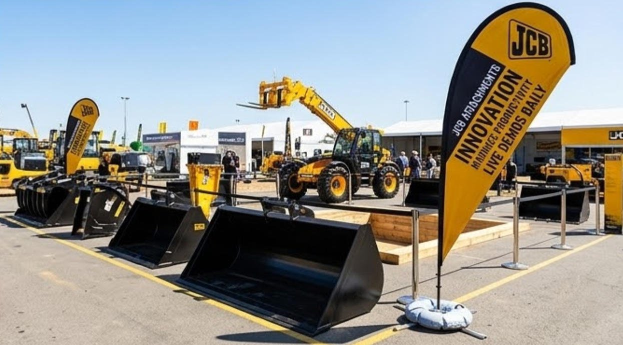
Teardrop flags are rather popularly used for advertising in and around Australia. They are most often used to advertise about the opening of new businesses like coffeehouses, salons, and restaurants, to advertise about upcoming events like a church fundraiser and an open house and even for advertising at different tradeshows across USA,Australia and New Zealand.

It shows how popular and effective feather signage is and how versatile it is in its functionality. However, you can reap maximum benefits from this flags advertising option only if you use flags from reputable companies like vancke.com.
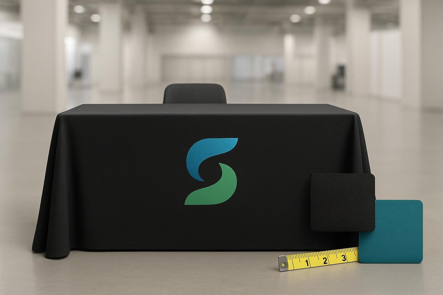
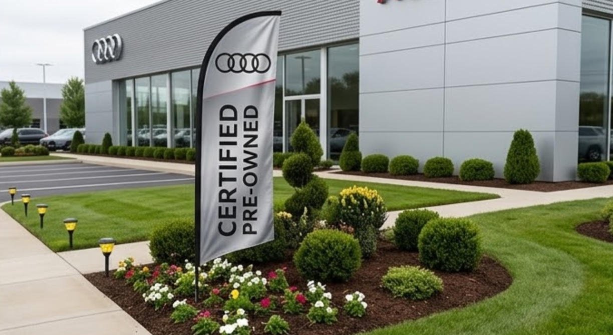
You know that you get the best customized teardrop flags from them that ensure the prints on their flags are long-lasting and the flag itself is durable. Besides good flag, customized teardrop flags give you better results.
Teardrop flag custom don’t take long to make
Many people tend to opt for standard feather signage thinking that they will have to waste time waiting for custom flag making. However little do they know that most companies send out your customized flags within 2-3 days of you placing your order.
Instead of compromising and using standard flags that don’t project your message and business in the best manner, it’s better to plan a few days and opt for customized teardrop flags.
Unlike standard flag advertising that use the same few words and colors to advertise about different events, Teardrop flags flag custom offer the benefit of letting you select the colors, artwork and font you want to use in them.
This helps maximize the effects and reach of the flags because you can incorporate your company logo, font, and colors. This way people who see the flags immediately associate it with your company and banner.

Though you may have to pay a tad extra for customized swooper flags, you can compensate on costs by buying wholesale teardrop flags. You can buy a few banners and use them in different places to increase your business reach and visibility.
Besides, teardrop flags are not a hassle to set up and dismantle too. They require minimal space, so as long as you get the right flags with the right colors and materials, they can help improve the number of visitors and customers you have for your business.
What you didn’t know about customizing teardrop flags
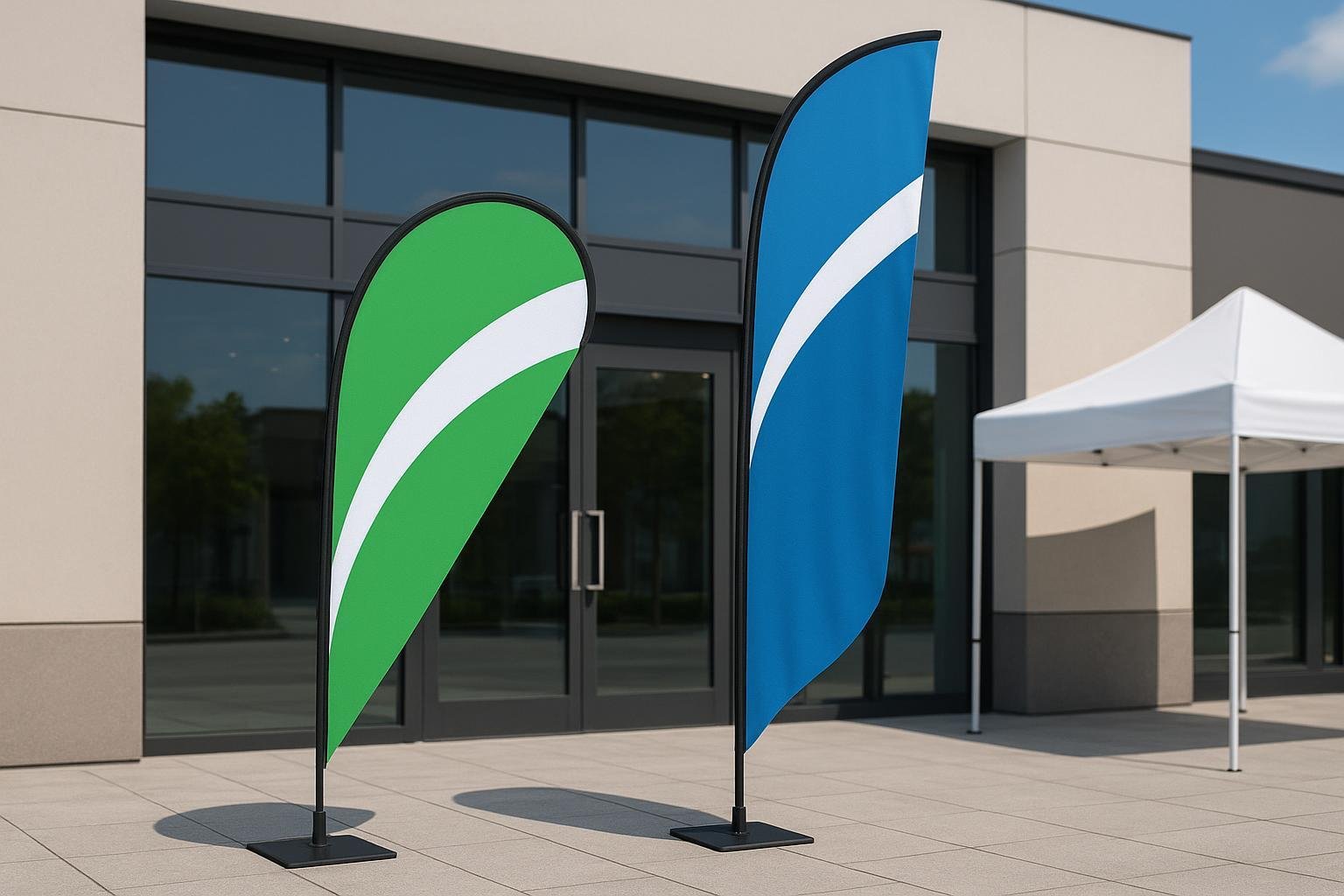
Now that you know why it’s better to have customized flags, here are a few tips that will help ensure your flag stands out from the rest. You may know that teardrop banners are made of a tear-shaped material where you can print on both sides.
However though unique in shape and design, you have space to print limited information on the banner. This is why you have to make maximum use of the available space to bring out the best effects using the following tips:

Avoid cramming words or information
Don’t cram too much information on the flag because you already know that it has limited space. A better option is to order a few flags, and as the feather flag base takes up minimal space, you can set them up in a line at the entrance of your store.
Instead of cramming everything into one flag, you can print a word on each flag using same or different colors whatever seems appropriate to you. This way there is a higher possibility of the flags capturing the attention of customers and passers-by. Besides, they will be intrigued to read each flag to find out what the entire message is.
Use the right font styles
Always use a maximum of two font styles on a banner. This is because the message on the flag gets even more difficult to read if more than two fonts are used in it.
Fonts that are most easily viewed and read from a distance are sans serif fonts like Futura and Helvetica. Use them to print the most important words and message on the banners.
Serif fonts like Times and Genguiat are better for printing the secondary message. However, fonts like the Old English Text are practically impossible to read from afar.
This is why it’s better to use them only on flags which you plan to keep in places like a conference hall or meeting room. Viewers here are stationary long enough to read and absorb whatever is printed on the banners.

It’s always better to select and use the font based on the business or event where the swooper flag will be used. While bridal shops and beauty salon banners can be designed with script fonts like Brush or Commercial Script, they won’t look appropriate on auto dealership teardrop signage.
Ensure proper visibility
Of course, customized teardrop flags come in various sizes. While the smallest offer minimal printing space, the larger ones do offer much more space for your content.
So if you need more space, and plan to set up the swooper flag someplace with unavoidable obstructions, then it’s better to get something taller and bigger. The chances of these flags being seen from afar are greater where you know they will be visible despite the obstacles.
Choose and know your appropriate overall design
It’s better to design your customized teardrop banner based on the overall message and intent you plan to use it for. It’s when you know what you want to relay through the cheap feather flags that you will be able to select the right text styles, colors, and backgrounds to use on it.

Less is always more in banners
A single word on a teardrop flag is the best way to print your message on the banners. But if you plan to print a few more words or your logo or any other graphic design, make sure it doesn’t fill up the flag space.
There must be space around the edges while designing your signage. This makes it easier for passers-by to read and understand whatever you have to say.
Even having too little print on the flag is a waste of money, and leaves a question in the readers’ mind. It’s always better to fill up the flagging space as much as possible while leaving enough white or empty space around the words for better and clearer visibility.
This is why most people prefer using words like ‘Welcome!’, ‘Sale’, ‘ Today’s Special’ and some sort of contact information like a phone number or web address on the wholesale feather flags.
This is much better than printing everything about the event on the sign.
The use of photographs and the right colors
It is always better to select and use a single color on your banner and stick to it for all your advertising options. This not only minimizes confusion and makes the flags look neater, but also maintains a sense of uniformity with all your advertising media.
Besides, the use of too bright colors, images and patterns may indeed help draw attention to your signage. However, too much of it only diverts the onlookers’ attention from your message and intent because it’s too difficult to read.
You can, however, use a high contrasting color combination for the background and letters printed on the flags. This is much easier to read than using a single color or different shades of a single color. Once again, you must choose your colors based on the type of business or event you will be using the customized teardrop flags for.
You can alternatively make use of full-color photographs on the banners to get your main message across. Most feather flag companies like vancke.com are more than ready and capable of printing any photograph you want onto your teardrop flag custom.
Use the right design software
It’s not enough to just decide on the right colors and shades for your teardrop flag printing. You should also use the right design software, preferably 3 vector editing software to get your design and colors right to print onto your banners.
The reputed and better companies like vancke.com do all the thinking for you when it comes to software. They have the best 3 vector editing software to ensure your prints and colors turn out just like you want them on the swooper flags.

Understand banner templates
Most wholesale feather flags companies like vancke.com have a huge collection of teardrop banner templates for you to use to decide on the best design for your flag.
Though the templates are a huge help, it’s only if you clearly understand the instructions and all lines mentioned in it. The wrong step can lead to a mistake. Most of the templates have red sewing lines.
They are there with a purpose, to mark boundaries on where you have to keep all important texts and graphics within. Don’t worry. These lines are not permanent. They will be removed before the banners are sent for printing.
Of course, if you are still confused about using the templates it’s better to turn to their in-house team of designers for help. This is a safer and better bet instead of trying to do something random on your own and commiting a blunder in the process.
Use CMYK and not RGB colors
Not many who design their artwork for teardrop signage are aware of the fact that you need to be careful while working with web and print designs. This is because the color representations in both are different.
While web designs use RGB or red, green and blue colors, print design uses CMYK or cyan, magenta, yellow and black colors. Monitors tend to emit light while papers absorb light.
So computer monitors display RGB colors at a low medium resolution of about 72-75 dots per inch while print production displays the 4 CMYK colors in high resolutions of at least 300 dpi.
While you can merge RGB colors to get all colors, monitors can display only a limited range of the visible spectrum. This means that if you want to convert your web files for your signage artwork, it is better if you change the format from RGB to CMYK.
Of course, most teardrop companies like vancke.com do this for you or at least inform you about this. But its’ always better to confirm to ensure you don’t end up unhappy with the results!
Save your artwork properly
Once you have decided on your artwork, colors, and content for your teardrop signage, you must save the file in the right manner. Most important, it’s better to first convert all the fonts to contours or outlines.
This especially applies to any new or unique fonts you may add to the signs because the company may or may not have the specific font you had used. To be on the safer side it’s better to save your work to contours where the in-house designers will either use your stipulated font or look for the font you use and implement it in your teardrop banners.
Don’t forget, it’s always better to use high-resolution logos and images in your file because they look better when printed to give you a much better representation of your artwork.
Don’t forget to embed all the relevant images and links to the file too. Saving artwork in PDF files eliminates any software requirement and compatibility headaches there may be with the signage company. It’s better to use Illustrator files saved in PDF because they look just like your Illustrator file.
The banner company can then easily view it with a free Adobe Acrobat Reader. The reason it’s better to use Illustrator for a print-ready PDF is because Illustrator keeps the vector content editable without sticking to the native Illustrator format.