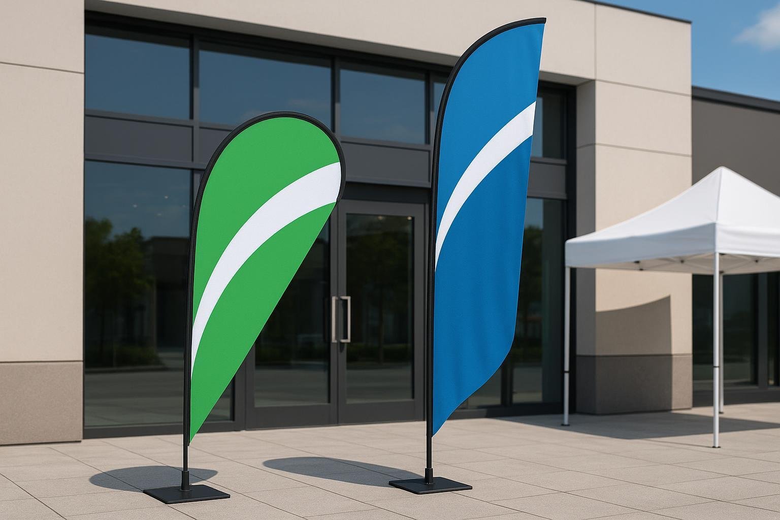
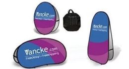
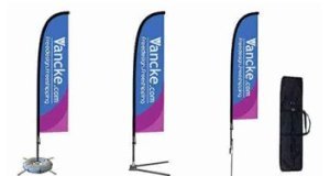
Personalized feather flags are economical, practical and convenient advertising options. They can be used for multiple purposes which you can quickly set up anywhere you want. It’s because of this that so many people resort to using customised feather flags to advertise about their wares and company at trade shows and events.

This can make it difficult for your branding to stand out from the crowd as the visitors to the event will get overwhelmed with so many flags and advertising. It’s left to you to ensure you make the most of your banner to ensure it gets noticed and stands out in the crowd.
One mistake is all it takes
No matter if you choose the tallest flags to be seen from afar, if you choose something to attract passers-by or if you use a double or single-sided flag, they will work only if the colours, text, layout and design elements used complement each other.
All it takes is one mistake in any of these items, and you may not be understood or seen by onlookers. So if you are not confident enough about producing the best-personalised feather flag, do hire a graphic designer to do it for you.
What is the purpose?
When you get about designing your feather flag, you first need to decide its purpose and what you plan to achieve through it. You can use the flag to promote your brand and make people buy or get more information about you.
You can also use it to convey a message and help visitors remember your name and address to return later? Another use is for providing directions at a trade show to your booth or you can use it to designate the start and finish of a race or event.
Content tips
Once you are sure about the purpose of the flag, you need to decide on its content. You have to choose the right message to convey with the correct use of logos, elements, text, images and colours.
While the text is mandatory in any flag, print only essential information and keep extra words to not more than seven words. Avoid printing telephone numbers and email addresses, but you can include your website URL for contact purposes.
Choice of font
Regarding your choice of font, you have to choose based on who your feather flag targets. If it’s related to children, use some fun and chunky multi-coloured fonts and if it’s for builders, real estate agents or engineers, use something bold and solid formal fonts that are coloured black or some dark colours.
If it’s for a creative business like hairdressing, tailors, personal services, crafts or photography, you can use script or stylized fonts, and if it’s for solicitors, accountants and estate agents, single coloured classic fonts are a better choice.
A combination of simple script fonts with classic fonts is best used to personalise feather flags for sports, cycling, running and skydiving events or clients. You can make the text stand out better by using graphic effects like shadows, background strokes and colour gradients.
Colour combination
Your personalised feather flag will comprise of various shades used in its background, image, logo and text. So choose your colours wisely, that’s relevant to your activity or message. Complimenting and contrasting colours are best for specific brand logos while strong blacks, blues, reds and primary colours are better if your audience is mainly men.
In case of a female-dominated audience, use pinks, cyans, mid greens, pastel and complimentary shades. If you need help matching colours, there are loads of colour wheel images you can download to help you out.
While choosing colours, remember that different people respond to different colours differently. While orange is considered a ??warm’ colour, blue is considered to be ??cold’. Colours also have emotional meaning and can generate specific emotions and empathy for a brand. As the feelings are different amidst different people and cultures, it has to be remembered while choosing colours for your logos and flag designs.
Use the right images
You can make your personalised feather flag come alive and stand out from your competitors by choosing and using the right graphic image or photo on the flag. You can either create your customised graphics, hire someone to do it for you or even buy pictures from various online sites like Shutterstock.
However, you have to choose high-quality images to get a good finish on the flag. You can also use software packages to enhance medium quality JPG images into something stunning to electrify your banner.
Plan your layout well
Now that you got your colours, images and font right comes the most challenging part of designing your flag, creating the perfect, eye-catching layout. While there are no specific rules to follow, it’s better if you have your logo at the top and if space permits, another at the bottom of the flag.
In case your logo doesn’t have your company name, set it sideways, to read from the bottom to the top. While vertically aligned text works usually works, there are instances where it won’t.
Any strapline is best placed parallel to the central text line, using a smaller sized and different font. Always use a single, powerful, attractive image and not full-flood background images. And lastly, the website URL is usually placed horizontally at the bottom of the flag.
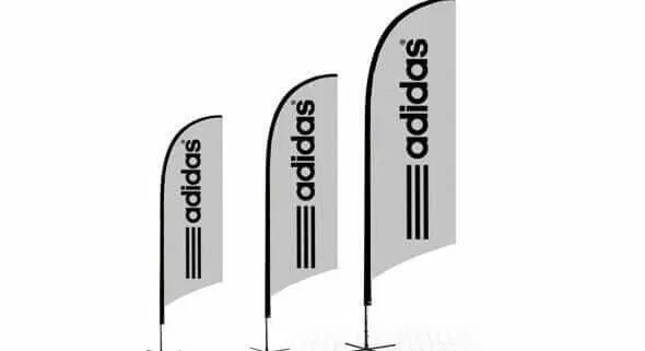
Personalized Feather Flags
So now no longer what type of personalised feather flag you choose, a double or single sided one, or one with a cross base for indoor use or one with an in-ground spike for outdoor use, these tips should help you create an eye-catching display that sets your flag apart from your competitors.
You will appreciate the attention the flag garners, as it justifies the money and effort spent creating the flag. Of course, placement is the last point to remember too for maximum visibility of your banner. Don’t just randomly place it somewhere. You need to choose a spot with maximum traffic, and chances of people interested in your business, event or product seeing your flag.
