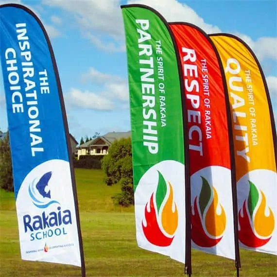
When you think about the colors of feather flags, you generally think they are added to make the flag look better and prettier. In short, colors are associated with improving the looks and attractiveness of the flags.
However, did you know that the colors on your flags have a much bigger role to play?
Yes, the right colors go a long way at influencing the customers’ psychology, and perhaps even get them interested in visiting your store or doing business with you.
[lwptoc]
The psychological effects of colors
You must have heard about buffalos getting aggravated by the color red. That’s the reason why matadors use a red flag to attract its attention and entertain the audience.
It’s not just the buffalo’s that’s affected by colors.
Even colors have a huge impact on the emotions humans experience. In fact, specific colors have specific effects on different people. And it’s these effects that anyone marketing their ware like advertisers and interior designers uses to market their wares effectively.
As long as you know how to use your colors effectively, you will be able to maximize the impact on your feather flag advertising. Different colors can make you feel happy or sad, hungry or relaxed, based on your cultural imprints and biological conditions.
For example, you need to know that warm colors evoke different emotions than cool colors. Similarly, bright colors tend to trigger different feelings than muted ones.
It basically depends on how or rather what effects you want the colors to invoke, and in your target audience. It also depends on the color’s brightness, tint or tone, and shade.

How colors are segmented
Colors can be divided into different types based on the effects they trigger in humans. You can accordingly use the colors to create the effects you want through your feather flags.
Warm colors
There are a few colors that are referred to as ‘warm colors’. They are red, orange, and yellow, which are found close to each other on the wheel.
These are the colors that tend to trigger feelings of happiness, energy, and optimism. However, they are also equally effective at grabbing attention and signaling dangers.
For example, red signifies the need of taking action, which is why it’s used in stop signs, hazard warnings, and barrier tapes. But there’s another interesting use for the red color.
It’s also used for increasing a person’s appetite, which may be the reason why brands like Pizza Hut, KFC, and McDonald’s all have the red color in their names and logos.
Cool colors
Next in line re the cool colors, which include green, purple, and blue. They are grouped into cool colors because they create a calming and soothing effect.
That’s why these colors are predominantly used in the branding and marketing of companies involved in the beauty, health, and security sectors.
Purple is the perfect color to use in flags or advertisements where you want to spark a feeling of creativity too. It’s probably because purple is a secondary color, and a combination of blue, known for calmness, and red, known for intensity.
Happy colors
If your feather flags are for a birthday, season’s greetings, or any other happy event, then look for happy colors. These are colors that invoke a feeling of happiness in the spectator and are warm colors like yellow, pink, red, and orange.
It’s no wonder you have red banners for Christmas, season’s or discount sales, and other ‘happy’ events!
You can also use pastel colors like light pink, peach, or lilac. It’s because these are colors that will make you feel better and put you in a good mood.
In short, the brighter and lighter is the color used in the flag, the happier and more optimistic the flag will make you feel. You can also create a feeling of happiness by combining various primary and secondary colors. It’s because these combinations tend to create a youthful and colorful effect.
Sad colors
These are colors that are better avoided in your signage. They do not help in making the spectator want to deal with you or attend your function.
These are colors that only trigger pessimism and make people think twice before attending your sale, event, or shop.
So what are these sad colors?
Yes, grey is one of them and is in fact the most known and famous sad color. However, there are other dark and muted colors you can add to the list. It induces blue, green, and something neutral like brown or beige.
Besides, remember that while black is a color that’s associated with mourning in Western culture. It’s different in the case of East Asian countries. White is the color used to depict mourning here.
So you see, you have to choose and use your colors in your feather flag not only based on the shade and event but also based on where you are!
Calming colors
As the name implies, these are the colors that trigger a calming effect. They make you feel calm and not agitated when you look at them. So they are generally ideal to use in feather flags for wishing someone or perhaps while listing out sponsors at an event.
It’s usually the pasted colors, and cool-toned pastels like baby blue, mint, and lilac that have a calming effect. Even neutral colors like white, grey, and beige may in the right shade, make you feel calm.
In short, the fewer colors that are combined, and the simpler is the look and the design of the feather flag design; the more claiming are its effects.
Energizing colors
Now in case of signs used to advertise about an excited or much-awaited event. There’s so much excitement and anxiety in the air, as people look forward to it.
The best way to match these feelings of excitement and energy is by using energizing colors in the banners. And these are the bright, strong, and neon colors like bright red or yellow, or neon green.
Royal blue, magenta, turquoise, and emerald green, which are highly pigmented and strong colors are also energizing.
These colors have a powerful effect on your emotions, where they tend to make you feel more alert. They are powerful enough to grab a person’s attention from afar and make your banner stand out in a crowd.
These flags will make most people feel refreshed, energized, and looking forward to the event. However, make sure you use them in the right places.
It’s because these energizing colors can be too energetic for some. They may only end up irritating the eyes, and poor advertisement.
Use your colors based on your target audience
Yes, you need to consider your target audience while selecting your feather flag colors. It’s because, as mentioned above, the colors that create energy in some customers may only end up irritating and turning off others.
The wrong colors can also create and project the wrong image and message than intended, to the wrong audience.
The good news is that the perception of colors tends to differ only between regions and countries, and not in a specific space. So with feather flag colors, there’s not much to worry about the target audience, except for perhaps the age and gender.
However, if you are considering colors for your website where you have a global market, then you have to consider different cultural implications of colors before selecting them.
Sometimes, you may have no option but to create separate or unique signs for different regions. You can this way safely reach out to maximum customers.
And when you look at it this way, if you are catering to a global audience, it’s better to maintain some uniformity in your colors. Use the same colors for all your advertising in each region, like in your feather flags, website, uniforms, and overall branding.
Understanding the effects of colors on you
It’s interesting to find out about the effects specific commonly used colors have on your target audience. Knowing them will give you a great idea of which colors to use in your banners.
However, as mentioned above, your audience depends on the country. Here are the typical effects of different colors on a North American clientele.
White
White is a color meant to signify virginity, purity, and innocence in most countries. That’s why white is commonly used for bridal gowns and infant clothes.
However, as mentioned earlier, it can also be used for mourning in East Asian countries. It’s the color of attire worn to funerals in these places.
But when you think about its other applications, white is also a color used to symbolize cleanliness, innocence, and purity. It can also signify sterility, which is why it’s a popular choice in hospitals. As it signifies purity, white can be used to advertise about pure, additive-free food products.
White is also a perfect color to use as the background in your feather flags. It’s because designs with a white background are minimally aesthetic, and projects a fresh and simple, clean look. Besides, white is considered to be the most neutral color of all, easily complementing most colors.
Black
Yes, black is considered depressive in most cases and situations, which is why it’s the color for mourning. However, it can also in some cases are used to project luxury, seduction, and a feeling of mystery in your advertising and banners.
This is a common color used in most banners because it’s a great color for a background, complementing most colors. It’s the perfect choice to advertise the designer and luxury goods and events.
Not only is black a color designating power and elegance, but it’s also ideal to project professionalism, neutrality, and simplicity.
Green
When you speak about green, it’s a color that is associated with money, and nature. It’s also the color used to represent freedom, freshness, and tranquility.
It’s no wonder most supermarkets have green in their signage, or at least in carrying bags. And as green is correlated with money, it’s also commonly used to advertise about finance.
And as green has a very soothing effect, it is a color most interior designers like using. It also makes you feel refreshed and optimistic, making it a common color option for health products.
It’s a soothing color and is relaxing, calming, and easiest on the eyes. It’s the ideal color used for creating balance in designs and if you want to print feather flags depicting a company’s growth or security.
Purple
Now, this is a color that signifies rarity because it’s not easily found in nature. But it’s a common color to use while targeting a female audience because it gives a feeling of feminism and romance.
And as purple projects royalty and spirituality, it’s commonly used to make something cheap look classy. Light shades are popularly used to market beauty products and in designs depicting luxury and wealth.
Red
Red is an active, and common color used in the marketing niche. A strong, warm, dynamic, anger, exciting and fast color, it’s popularly used to suggest speed and power.
It’s no wonder it’s a common choice in feather flags for video games, comic books, and fast-food restaurants. Red is ideal to draw attention to a specific design element, but can at times get overwhelming if used as an accent color.
Blue
Blue can be used in feather flags for services and companies known for productivity, clear thinking, faithfulness, authority, and dignity. It’s, in fact, a flexible color, which is why its popularity used in so many ads ranging from ads for electronics to educational materials.
Another reason why it’s popularly used in banners is that it’s known to trigger calm, spirituality, and a feeling of security and trust. While dark shades are ideally used in corporate designs because of their professional look, the lighter shades depict relaxation and friendliness.
And with social sites like Facebook and Twitter being both relaxing and friendly, it’s no wonder they use light shade blues!
In short, colors do indeed have a psychological effect on human minds. But as different colors can appeal differently in individual countries and demographics, keeping this in the account will definitely help you get the marketing results you are looking for.