[lwptoc numeration=”none”]
Color is an essential component of every design. Colors attract attention, elicit emotions, and enrich many aspects of our lives. Choosing a decent color scheme for your bespoke flag is so critical. You might have a row of feather flags on the roadside near your shop, and no one would notice because the colors don’t grab your attention.
If you are unaware of the significance of colors in a personalized flag, you will undoubtedly overlook some of the most significant components. However, there must be a decent starting point.
So, suppose you intend to use a personalized flag for retail shop advertising or any other reason. In that case, you should consider the color carefully because it aids visual recognition more rapidly than words.
Why Is Choosing the Colors of Your Flag Important?
Certain aspects of design, such as color, have a psychological impact; they cause our subconscious to interpret the brand’s message in a particular manner.
When it comes to your company, how long does it often take for someone to create an opinion? According to studies, most individuals have an unconsciously formed opinion about a product within the first ninety seconds of observing it. Up to ninety percent of that evaluation might be based on color alone. Utilize the psychology of color to select the optimal tone that will assist your brand in standing out from the crowd and making the most of the time you have available to produce an impression that will last.
What Do Different Flag Colors Mean?
The color of the custom flags is crucial for various reasons. The first is that it improves visibility, and the second is that it may make the words easier to read. Both of these aspects contribute to the overall significance of the color. You may use the flag to convey words or messages to your audience that correspond to the color you select to make it easier for them to remember your brand.
The following is a short rundown of the most common color meanings and the impact various color schemes used in branding may have on individuals.
Red — Bold and Brave

Turn the dial to 11 and rev your engines. Thrill-seekers, adventurers, and those who want to live on the edge all gravitate toward the color red. Because of its ability to evoke excitement and give off an impression of young energy, red is the ideal hue for drawing attention.
It’s better to use this hue sparingly since it’s the easiest to go overboard with, even though its intensity evokes powerful feelings. Some people use the color red to encourage people to take action by using red buttons and callouts. Others use the color red to bring attention to your most essential message by creating a bright red bespoke banner that is noticeable no matter where it is placed.
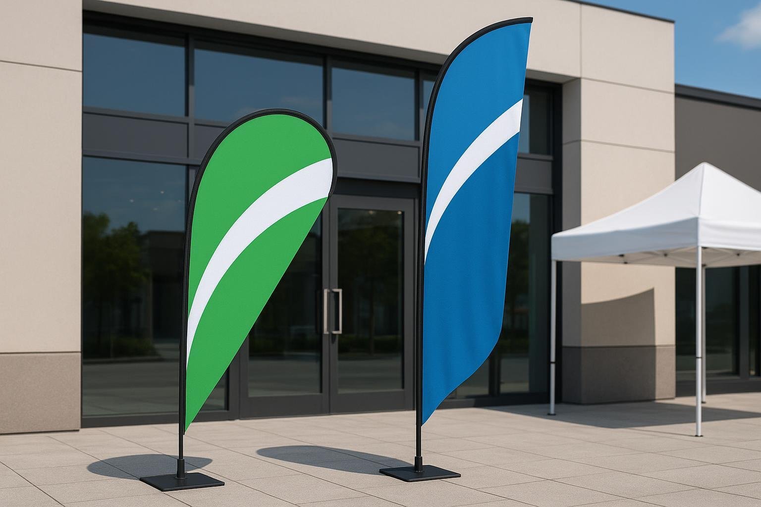
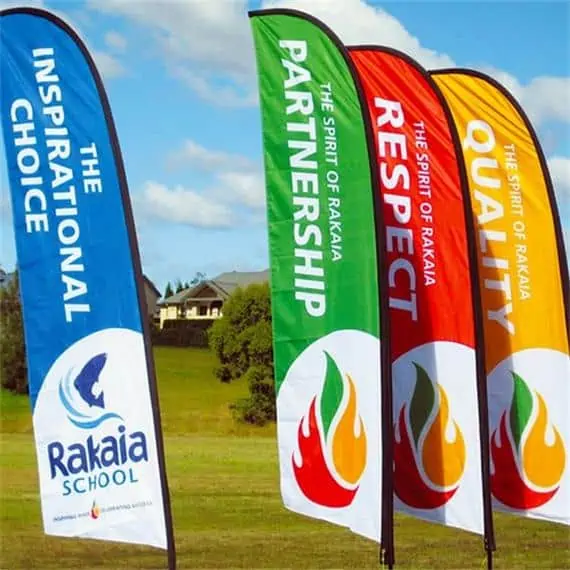
Given these, red is perfect for flags designed for sporting events, storefronts, and outdoor gatherings — those designed to be attention-grabbing even in busy areas.
Orange — Cheery and Confident
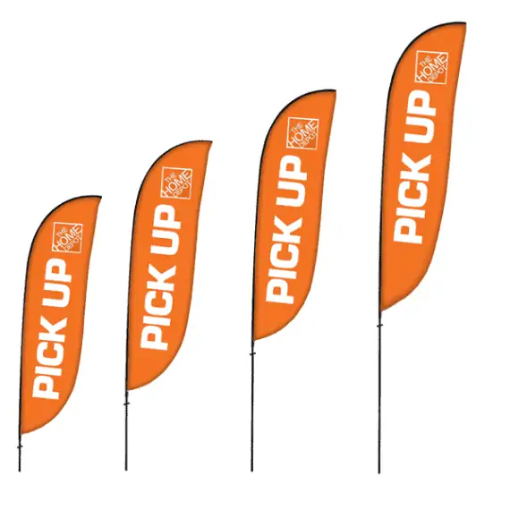
We all know at least one person who can converse with anyone on any topic. That’s an orange hue for you. It exudes self-assurance and commands attention, much like the color red, but much more modestly. An orange banner generates an atmosphere of friendliness and togetherness, attracting attention without putting people off.
Orange, another warm hue, is regarded as light and joyful. Thus, it is appropriate for less ‘corporate’ and more fun companies. This makes orange great for capturing the attention of the younger demographic, like teenagers and children.
Orange is a good color to demonstrate that you know what you’re doing without appearing overly assertive. It might not be as striking as red. Still, the more subtle approach it adopts to drawing people can be just the tone you must establish to connect with your clients amicably.
Blue — Strong and Reliable
Unite forces with a color that you are confident will have your back. When you add a shade of blue to your personalized flag, you establish a sense of trustworthiness, even if blue may not be as attention-grabbing as other snazzier hues.
Blue is also a color that is widely preferred by most people, regardless of culture, nation, age, socioeconomic group, or gender, making it the safest color to utilize in any of your market segments.
This is the ideal method for connecting with clients who need faith in you and your work, whether taking care of the household or bringing a priceless antique back to its former level of splendor. A blue banner will ensure that your clients remember your organization as reliable. Blue is a color frequently used by industries to evoke associations with quality assurances for their products or services.
Green — Life and Peace
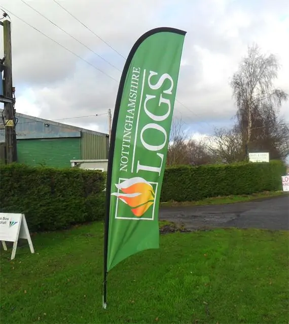
The color green, which has its origins in the natural world, is associated with vitality and wellness, evoking ideas of expansion, wealth, and generosity. Customers get a sense of serenity and relaxation from it, similar to what they get from the hue blue. This feeling carries over into how they think about your company.
A green banner is an excellent way to interact with those interested in health and fitness and demonstrate how eco-friendly your business operations are. Its optimistic energy for the future inspires people. It is the ideal hue for a bespoke banner if you want it to seem like the beginning of something wonderful.
Using green on your flag may connect your audience to all things growing, making it an excellent choice for food and fitness companies. Green has traditionally been connected with money, making it an appealing choice for flags connected to financial and luxury goods industries.
Yellow — Warmth and Joy
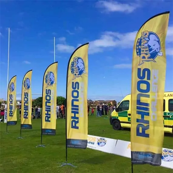
Yellow feels fantastic – it’s like walking in the sunshine. There are many upbeat songs dedicated to the sun, and there is a solid explanation for this. If you want to cheer someone up and put a smile on their face, a pleasant, optimistic shade of yellow is the best option for a bespoke banner you can choose.
Yellow is a bright and strong color, making it great for attracting the attention of younger generations. However, avoid using yellow for flags targeting the more mature generations, as they may view yellow as too stark and invasive.
Add just a little yellow to your design. It will be easier for people to identify your message with anything positive, and it will attract attention in a gentler way than orange or red would. People have the impression that their lives are going well when they see yellow since the color conveys cleanliness and innocence. Put up this bright banner; even if the weather outside is gloomy, you may still make your clients smile.
Pink — Passion and Fun

There is much more to this vivid color than meets the eye regarding its connotations, even though pink is commonly linked with a feminine audience (interesting fact: it was once a color associated with men). The color pink has long been associated with the concept of selfless love, and incorporating it into the design of your handmade banners is a great way to show your enthusiasm for your work.
Many pre-adolescents and teenagers prefer the color pink for its whimsy. At the same time, the older generations may view pink as calming and soothing. If these two are your target markets, then a soft shade of pink is the way to go.
Like the color orange, pink creates a powerful emotional response and fosters camaraderie in other people, but in a more carefree manner. Suppose you want to wow people with how much you like what you do or make a powerful statement. In that case, you can do it by giving this banner or any of your important statements a dash of this lively hue.
Purple — Creativity and Wisdom
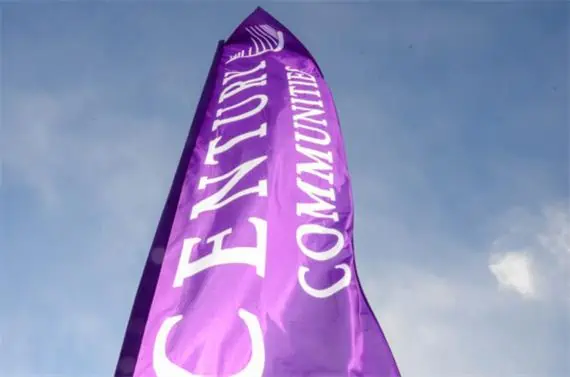
Your message will come across as more forceful if you use some purple in the design of your personalized banner. Commonly linked with royalty or aristocracy, purple provides an air of wisdom that helps clients feel safe coming to you. Since of the deep roots that it comes from, it is an excellent hue to utilize when you are trying to link clients to anything creative because it helps people’s imaginations go wild.
When it comes to using the color purple, it’s all about crafting the appropriate story. If you have the appropriate design template, you can go from demonstrating your power to opening up a new world of possibilities for curious explorers. Be cautious, though, because an abundance of purple might give off a somewhat arrogant air. After all, there is a good reason why it is connected to royal families.
Purple may boost your brand since it represents both royalty and innovation. This makes purple a great flag color for business expos and conventions — anywhere you need your professional creativity to stand out.
How To Build A Color Scheme
Choosing a branding color palette is arbitrary. Applying hard and fast rules to concepts like brand identity is difficult and dangerous. The procedure might be complex, so the advice is necessary. Here, we’ll outline our approach for generating a color scheme that you can use as a framework, not step-by-step instructions.
Try Starting With Three Colors
A base, a highlight, and a neutral are the three major colors you’ll need. Brand color schemes can contain 1-4 colors depending on the kind. However, even monochromatic schemes will need some variance in hues for diverse reasons.
The Base
Which of your brand’s personality attributes is the most significant? Your base color must not only reflect your brand’s most predominant attribute, but it should also connect to the target demographic you’re attempting to attract. You will choose the remaining colors based on how well they complement this one.
The Accent
Following your base color, the accent color will be the color you apply more than any other. This is more difficult than picking your foundation color since there are more constraints. In addition to matching a perceived brand trait, your accent color must also aesthetically match the base color and please your market.
The Neutral
Your neutral color will usually be a backdrop color designed to avoid calling attention to itself. Typically, they are shades of gray, although you can also use beige, whites, and off-whites. Black is another possibility, but be cautious because it tends to overwhelm any color palette in which it appears.

What Are The Best Color Combinations?
Color combinations for flags should be bold, complimentary, or triadic.
The interactive tool at Coolors.io (https://coolors.co/create) and Colorbook.io (https://www.colorbook.io/pages/colorschemegenerator) make it simple to produce a high-quality color palette.
Colors on a customized flag should complement each other, with the text and backdrop contrasting to make it easier to read (and retain). The usage of bright yellow in a design, for example, may divert attention away from the intended message—dark hues like black work nicely with light colors like pastel blue. If the flag is dark, utilize light-colored lettering or pictures.
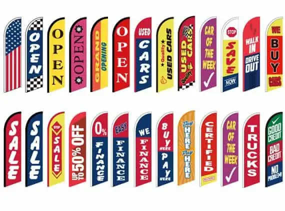
The following are the five most readable and visible flag color combinations:
- Gray, Black, Dark Blue, or Red Text on a White Background
- Great color combinations for what is considered traditionally masculine brands and heavily favored by the older generations.
- Red, Dark Blue, or Black Text on a Yellow Background
- This color combination works great for brands geared towards the younger target market, such as the toys and leisure industries.
- Black or Red Text on a Light Blue Background
- This is a classic color combination that’s perfect for general use and any industry, given the color blue’s universality.
- White or Yellow Text on a Red Background
- Putting the thrilling red and exciting yellow is best for attention-grabbing events, like sports, competitions, and any thrilling activity.
- Yellow or White Text on a Black or Dark Blue Background
- Dark blue and black backgrounds and a white or yellow text are reminiscent of suits, shirts, and ties worn by professionals. This combination makes flags of the same color exude professionalism and creativity, which makes it great for conventions and business expos.
When complementary colors are blended, they cancel each other out, resulting in a grayscale color such as white or place. The most dramatic contrasts are created when complementary hues are put adjacent to one other.
The term “complementary” refers to the pair of colors on the color wheel that are direct across from one another. Some examples are green and red, orange and blue, and so forth. Some of your favorite teams and institutions use the same color patterns.
The triadic color scheme is made up of three hues that are evenly dispersed on the color wheel. Red, blue, and yellow are primary colors, whereas orange, purple, and green are secondary colors. Using these rules to design personalized flags is a wonderful approach to creating something aesthetically beautiful.