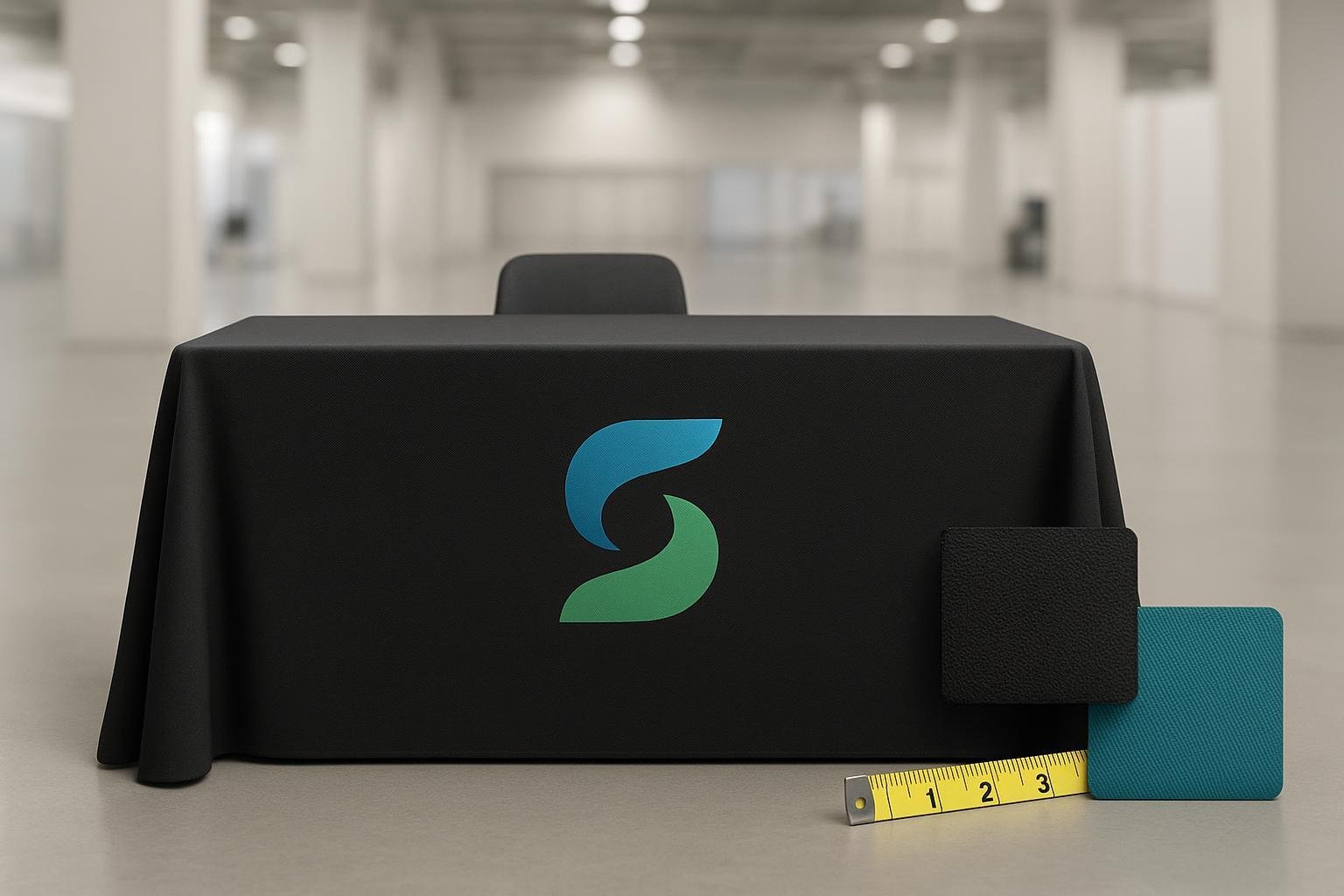
Investing in fluttering feather flags is one of the best decisions any business person can make. These banners are portable and can be set up and dismantled by a single person, without depending on, or waiting for someone else.
Besides, most outdoor feather flags for advertising are made of polyester, and your contact details and message is printed on it using direct dye sublimation printing process. This means that unlike other banners, the ink does not sit on the fabric but instead passes through it. So you end up with a wonderfully designed banner which flutters in the wind to capture the attention of passers-by.
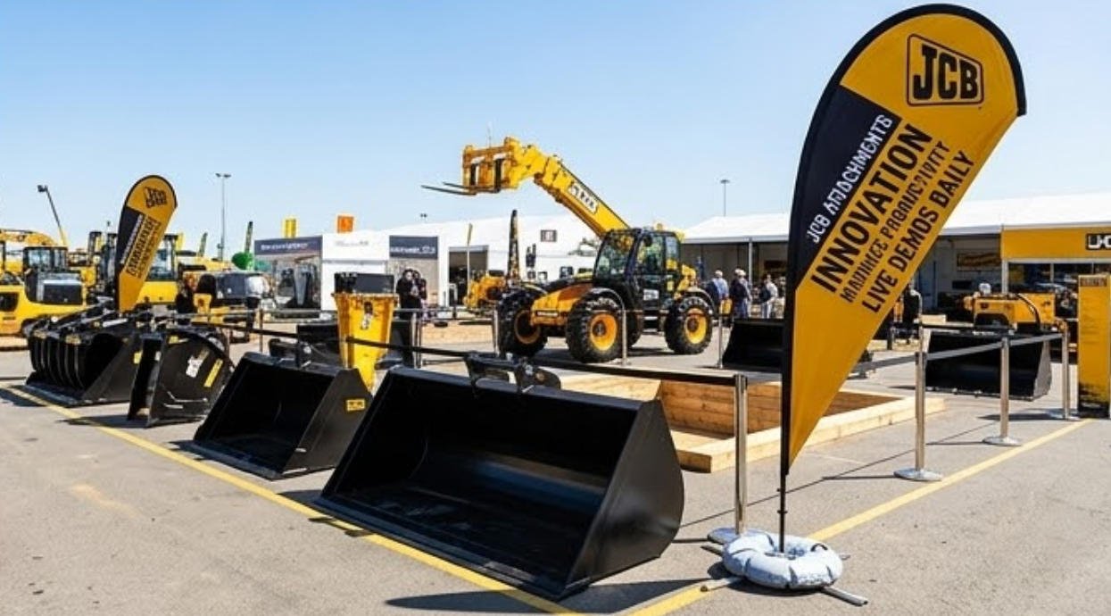
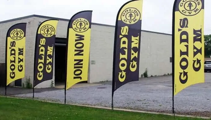
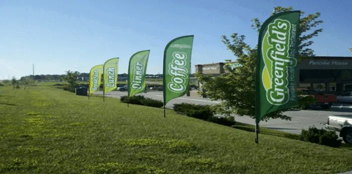
These flags make a worthwhile investment because they are great for outdoor advertising at events like grand openings, sports events, open houses or just to inform the world that you are open.
You can use them as many times as you want because the teardrop flag can be dismantled and conveniently stored away in a bag to use needed. You can even use them indoors to promote your trade show booth, your stall or even to give directions to your booth. All these features make this an ideal marketing tool especially for those on a budget.
However, despite all these advantages, they are worth it only if you use them wisely. Like any other promotional tool, the wrong use and certain mistakes can lead to a drop in the banner’s effectiveness.
So if you want to make your investment in outdoor feather flags for advertising worthwhile, and draw people to you, here are some mistakes to avoid while designing your flag.
Outdoor feather flags for advertising designing mistakes to avoid
1. Selecting a poor or small design
There may be some design you like, which you think will look great on your banner. However, before you make your final decision; remember that these outdoor flags have to be visible from afar.
So while the design may seem nice to you in front of you on your notepad or computer, it may not attract a passers-by attention. Not only should the sign attract their attention, but the main intention of putting up these flags is also to communicate and inform people about your opening or store or event.
The message won’t get across if people can’t see it. So make sure the font is most appropriate for the flag and also make sure you use the right colors for the message and background. They should basically have a good contrast because it makes it all the easier for people to read your message from afar.
2. Spelling or grammar mistakes
Remember that your sign is the first thing people see from your company. So it goes a long way at creating a good first impression. This means that any spelling or grammar mistakes in your banner will lead to a doubt in people’s minds about the professionalism of your organization.
It may even unnecessarily give your establishment wrong publicity. You can avoid this unnecessary publicity by thoroughly proofreading the content before getting it printed. It’s even better if you show the matter to a few people. Sometimes your eyes tend to overlook mistakes because you are familiar with the content. Who knows? They may even be able to point out some mistakes you had missed!
3. Forgetting contact information
Though unbelievable, many people tend to forget to include their contact information in their banners. They get absorbed into providing details about their grand opening, dates and times that they just forget about contact information.
A flag devoid of contact information is absolutely useless because interested people won’t know who to contact if they want to ask about something, or where to go. So make sure you include your phone number, website or a link to your social media profile. Choose and include the information based on who your target information is, and how they are most likely to contact you.
4. Too crowded and messy
There are some people who are exactly the opposite and try to include, or rather cram everything in their flags. They not only include their contact information but also customer testimonials, company history details and even include some images of their business.
All this is unnecessary in outdoor feather flags for advertising because less is always more here. In other words, you should focus on printing only important and essential information and nothing more.
Too much of information is difficult for your audience to digest, and understand. Remember, they get a fleeting glance of your feather flags. So they will not be able to absorb all of that information in a few minutes, and it’s very unlikely that they will even retain the information for long. Testimonials, images and company history all belong to your website. Just print necessary information which they are most likely to remember to use later on.
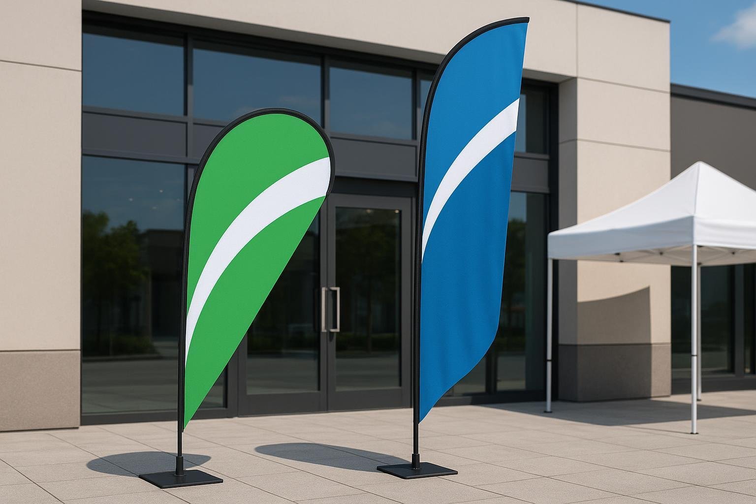
5. Wrong size for your venue
You’ll notice that teardrop flags come in various sizes. And it’s with a reason. The larger flags are meant for outdoor use because they can effectively attract window shoppers, passers-by, and drivers.
The smaller versions are better used for indoor events and festivals. So choose your flag accordingly because a small flag used outdoor will not be that effective at advertising about your event or business.
6. Wrong choice of material
Not only can the size, but even the wrong choice of materials also make your banner a useless investment. As this is an outdoor flag, choose a banner that’s not only durable but also water-resistant.
This way you know that the flag will last longer for you, and even serve its purpose outdoors when it’s raining. Similarly, the flag should be printed with UV-resistant ink so that the print lasts longer, and doesn’t fade too easily or quickly in the sunlight.
7. Choosing the wrong fonts or colors
The normal notion for anyone printing customized feather flags is to use their company colors on it. This may not always be in the best choice. It’s better to choose the colors based on where you plan to use the flags.
Contrasting colors will do in spots with lots of open space. If there’s greenery around, then it’s better to avoid using green and brown as these colors only make your banner blend with the surroundings.
It’s generally the bold and bright colors that attract people’s attention the best. If drivers are your target audience, then use red, yellow, blue and other colors corresponding to traffic signals because they notice these colors quicker.
When it comes to fonts, use something simple and attractive. Sometimes the more intricate fonts are not easily read from afar. It’s even better if you use large and bold lettering because they are clearly visible from a distance.
8. Choosing the wrong feather flag
Outdoor feather flags for advertisement are available in single and double-sided versions. You have to choose based on whether you expect customers to see only one or both sides of its sides.
The double-sided flags have your content printed on both it’s sides. This offers the advantage that it’s visible to people from both directions. However in case of a single-sided flag, the image is visible only from one side, and the colors tend to bleed to the backside. These flags are a better choice if you only expect only customers passing by in one direction.
9. Poor translation of words
You may at times want to expand your customer base. To do this, you need to make your flag and business accessible and interesting to everyone. This is especially so if you live in a multicultural city like Sydney or New York.
While printing flags in different languages is a good idea, don’t make the mistake of using poor translations of your message. Do not rely only on translation tools to create content in different languages.
While these tools are indeed helpful they are known to not always provide a 100% correct translation. This will lead to your printing messages on the flag which may either make you the center of jokes or you may end up hurting the sentiments of your target audience because the flag conveys the wrong message.
The best thing to do is hire a certified translator or some native speaker to create the relevant content. Though you may have to pay for the translator’s services, it’s worth it in the long run.
10. Placing your photo in the banner
No matter how good looking you may be, or how photogenic you are, do not make the mistake of including your personal photo to the feather flag. While you may find it appealing, there is a high chance that onlookers will mistake you for a politician running for office.
Besides, people tend to become creative whenever they see pictures of people on flags. So your photo may end up with a mustache the next day or even a blacked out tooth. This can, in turn, prove humiliating to you. Instead of going through all this, you may as well avoid including your photo in the first place.
11. Getting a third opinion
Just like it’s better to have a third person proofread your content, it is also better to have your friends, staff or relatives take a look at your banner before you send it for printing. The main reason for this is that different people look at things differently.
What you may feel is beautiful and attractive may not seem so to others. They will also be able to notice flaws and give some suggestions for better fonts or colors for increased and easy readability. They anyhow will be reading the message on the flag for the first time and will be able to tell you how quickly a passer-by will be able to read and grasp the information on it.
12. Doing your own printing
Just because some people claim that banners are easy to make, and can be quickly printed, there’s no need of taking the risk of doing it yourself. Though you may somehow manage to print them, you may not get a perfect, professional looking outdoor feather flags for advertisement.
It is better to leave it to the professionals like vancke.com who use the best materials, ink, and printing to give you the best banners for your company’s maximum visibility.
13. Choosing the wrong company
This is, in fact, the biggest mistake you may make while printing your teardrop flags. With so many companies to choose from, it’s natural that you end up confused about which is the best for you.
There are factors which should help you choose the right company like maximum options. With banners available in various shapes and sizes, it’s natural that you make use of the best for your advertising needs. So choose a company that will be able to provide you with various products to choose and use as per your marketing theme.
The rate is another factor to remember. It doesn’t matter if you are a large company or a start-up; you have to look for something that gets you your value for money. Even if you are on a budget, don’t opt for the cheapest company because there are higher chances of cheaper flags tearing or breaking.
It’s worth paying a little extra because the company provides you with quality materials and sublimation printing. You thus end up buying longer-lasting flags you can use numerous times.

It goes without saying that a more experienced company that has been around for a long time is always a better option. They will even help you avoid these mistakes, to make maximum use of your advertising budget and flag. One such company is vancke.com which has been working in the industry for a long time and knows all the ins and outs of it.
Now that you know the 13 mistakes to avoid while choosing and designing outdoor feather flags for advertising, you are sure to end up with a much better customized flag, which gives you more value for your money.